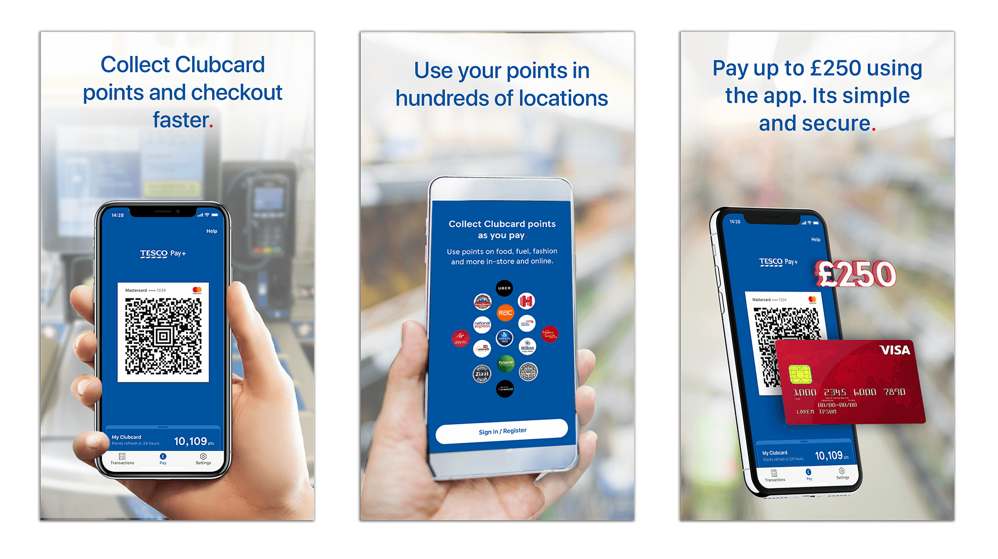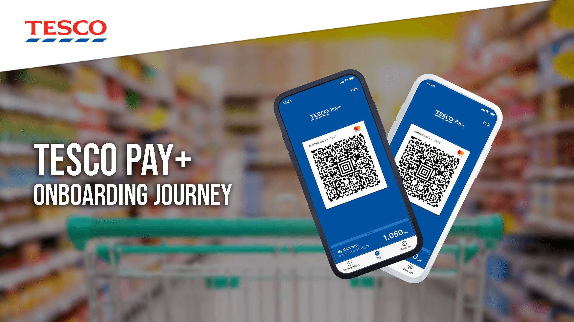
Tesco Pay+ is a payment app using QR codes, were customers can link there bank card to the app and receive Clubcard points at the same time as paying. Customers can pay up to £250 in Tesco.
The aim of this project was to increase the number of users who add a card in the onboarding journey. We noticed from the analytics that 50% of users did not add their card to the app.
The current onboarding
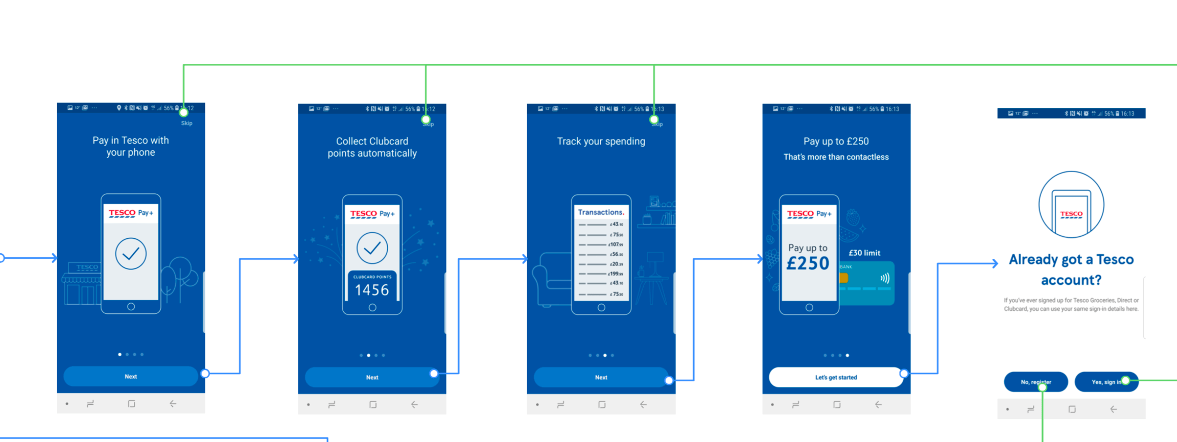
Observations with the current onboarding flow, when permission boxes appear there is no explanation of why they are needed and what the benefit is for the user.
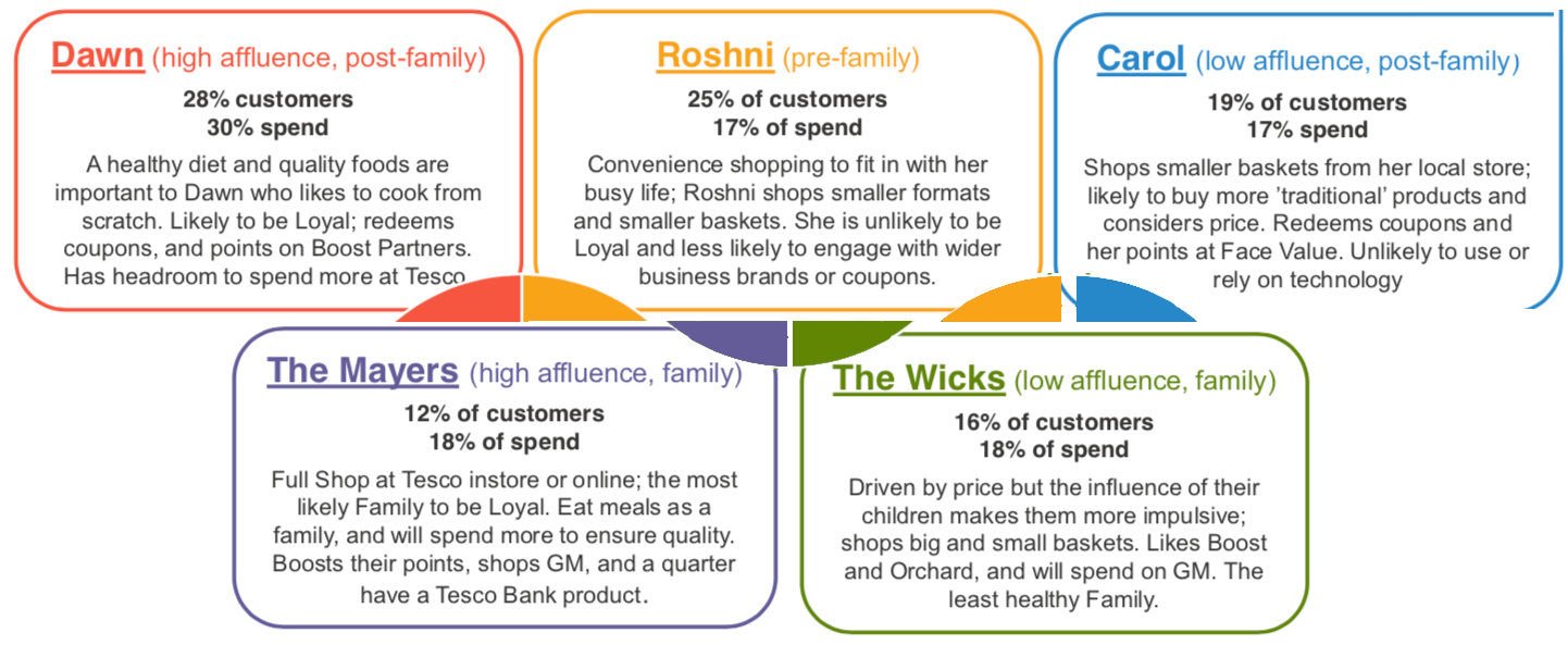
The user personas were not created by myself they were created to give a guide of different types of people who shop at Tesco. For this project we targeted the Roshni, Mayers and Wicks peronsas as they are they types of customers who value convenience and are used to using technology in there lives.
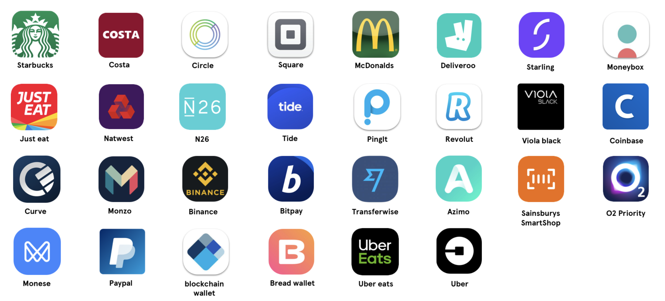
My first method of researching was to carry out a competitor analysis and the apps that offer similar propositions. These consisted of banking, fintech, crypto and other super market apps. I reviewed only the onboarding journeys.
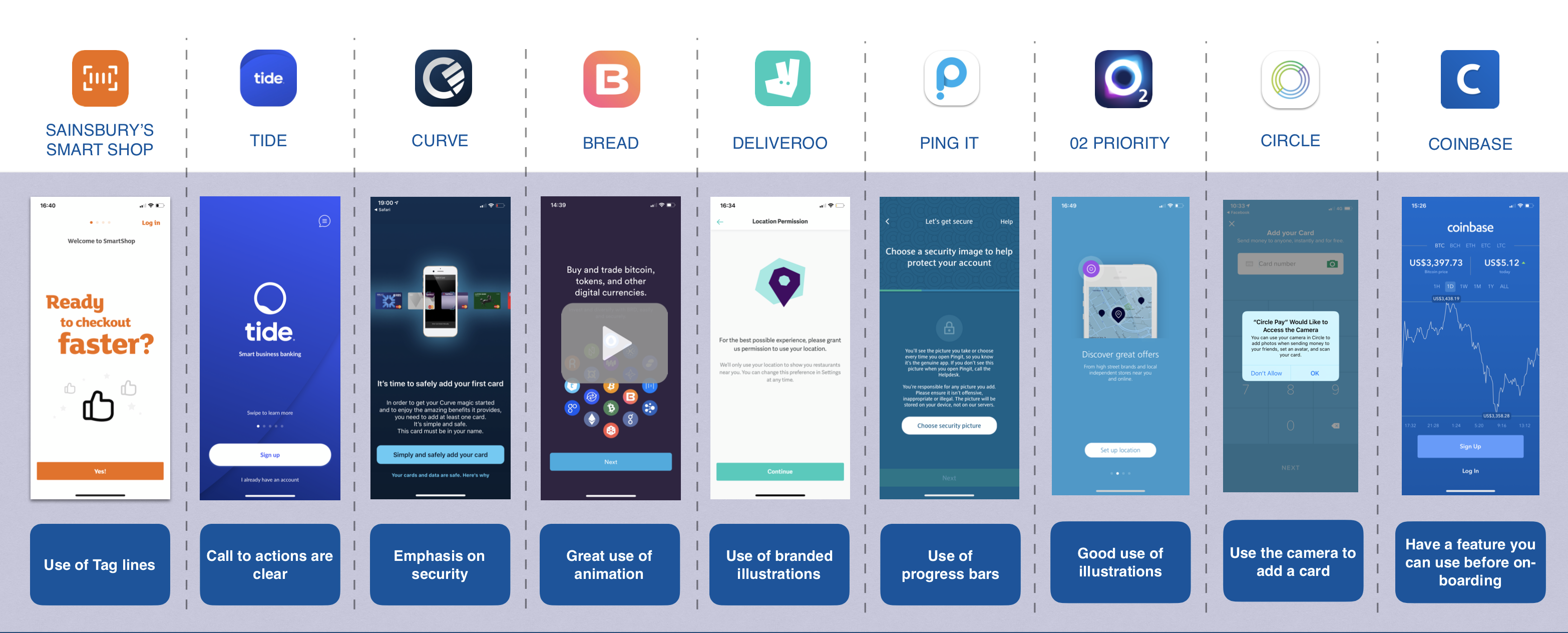
After reviewing all of the competitor analysis i I noticed that there were some recurring components used to try and help with the onboarding process you can find this on the presentation file.
After carrying out the research I then created 3 different wireframe solutions that incorporated some of the recurring patterns that we saw. Along with some concepts that we felt work well on other apps.
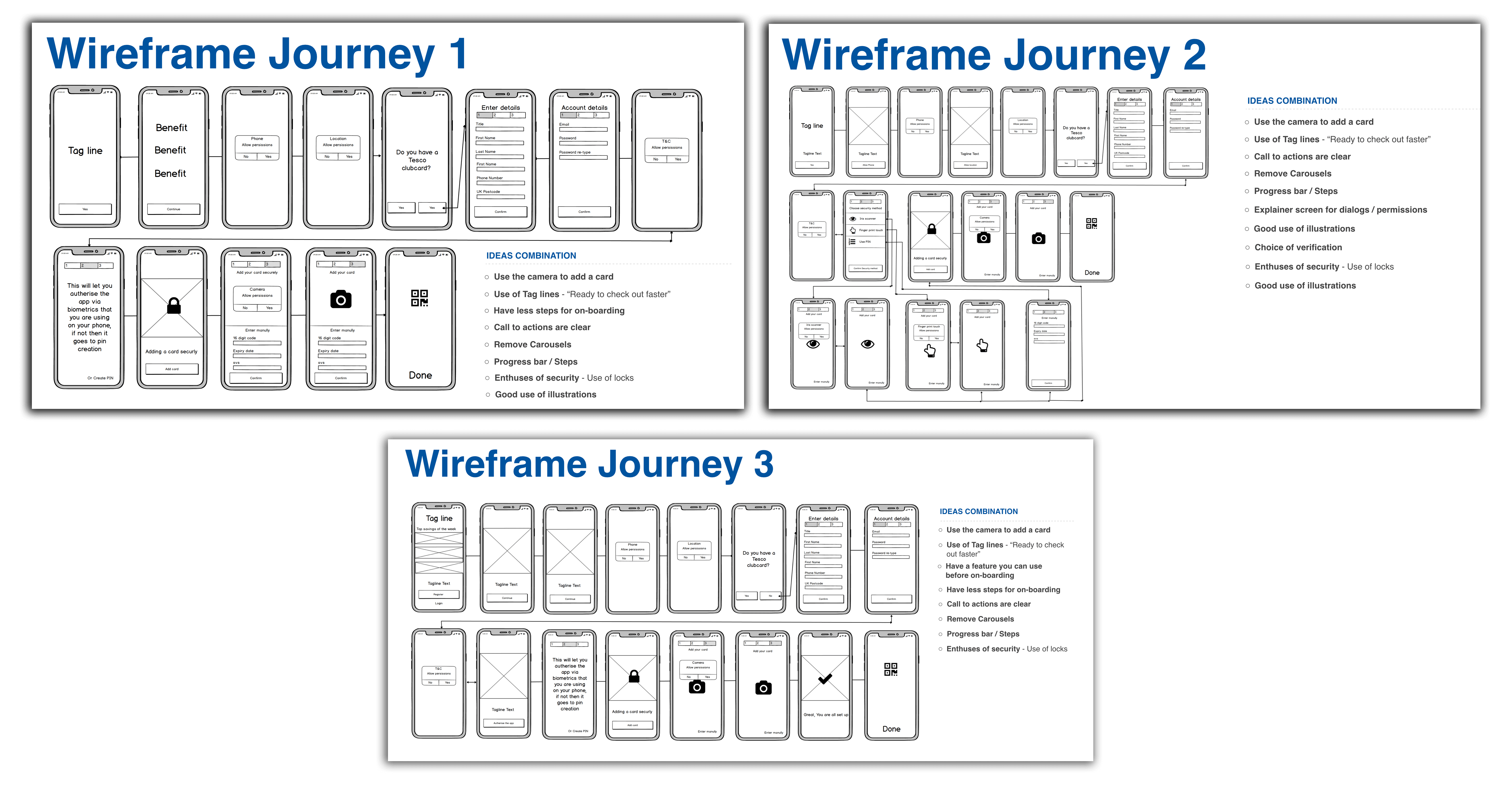
When it came to the design I kept in mind the research and the wireframes using these elements to influence my designs. Below you will find 3 different designs for onboarding. You will be able to see that they get more defined with each Test.
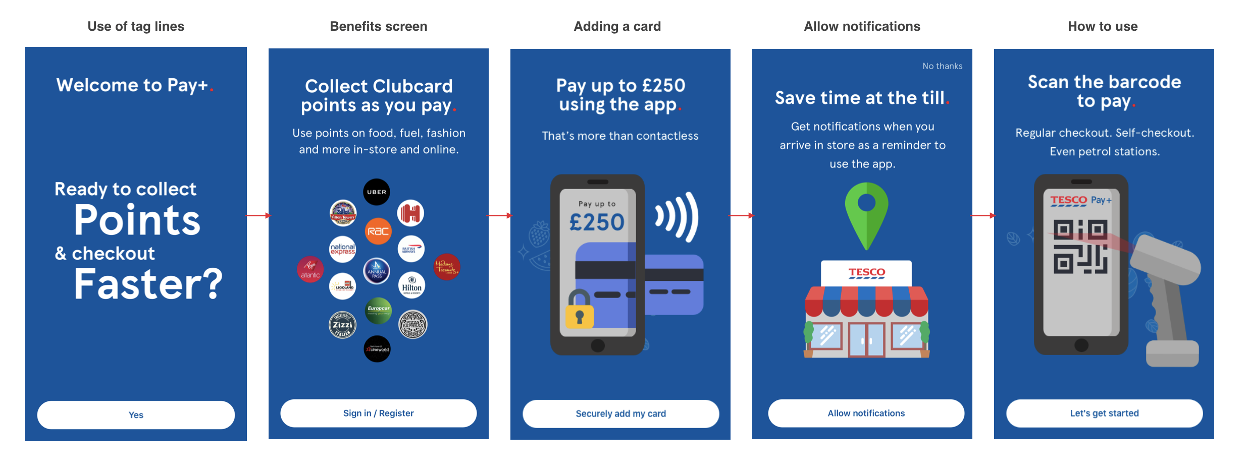
For this design I stepped outside the box, we decided to step away from the brand guidelines to test different types of design styles. The main thing I added was the camera first approach we noticed that 80% of people use the camera scan to enter their card details. This lead us to putting the camera as the first option for users.
To View the Prototype of Design Phase 1 click the button below
Add in the test from the end results here
To View the Test results of Design Phase 1 click the button below

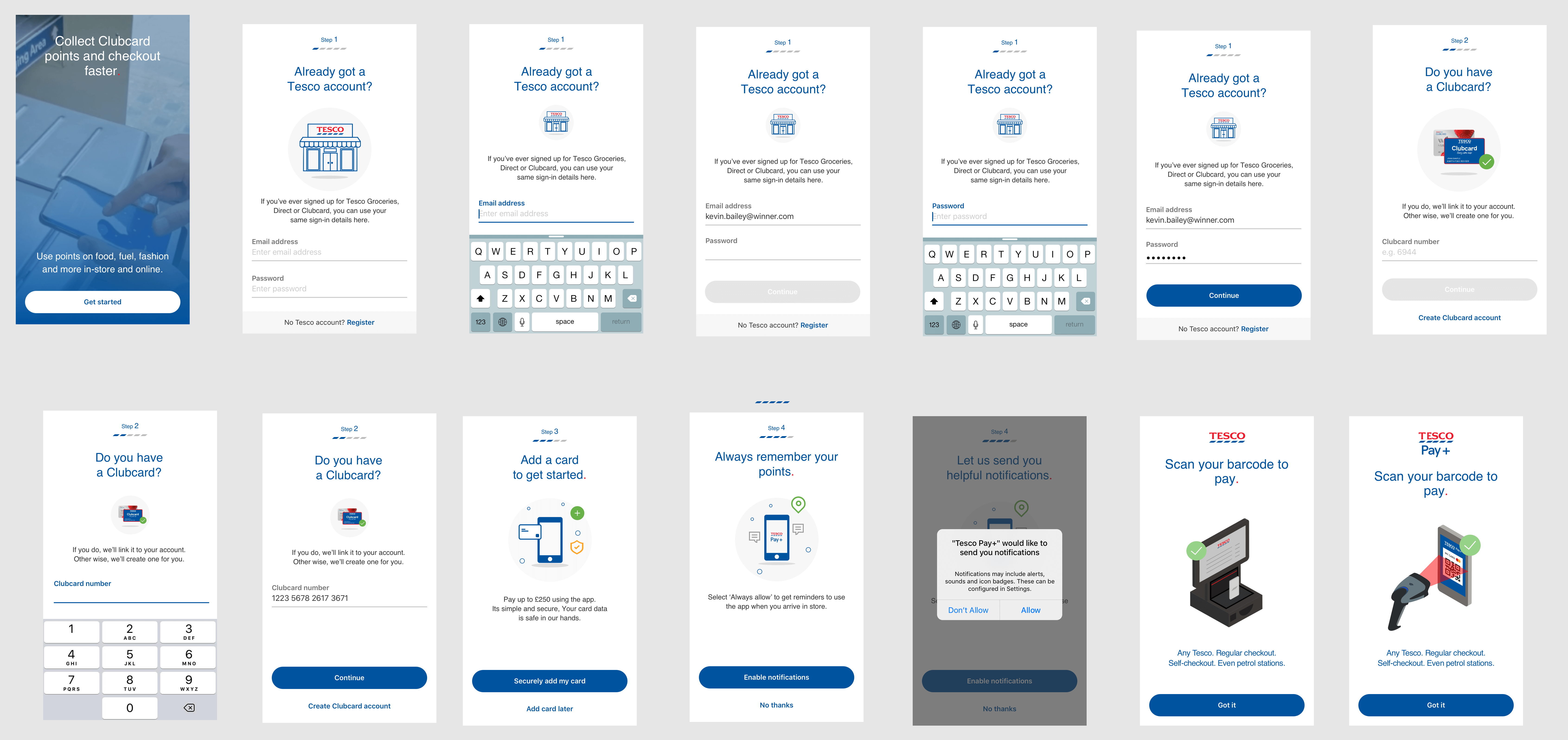
In this design we used the learning from the first test and tried to refine them, for example with the shop locator users felt that we didn't sell them a benefit so we reworked this to sell the message better, this design fits more into the Tesco brand guidelines and has more potential of being accepted by the wider team and stakeholders. In this design we decided to Test video as we noticed in the previous test that people said ‘it would be good to have a video showing how you would use the app”.
To View the Prototype of Design Phase 2 click the button below
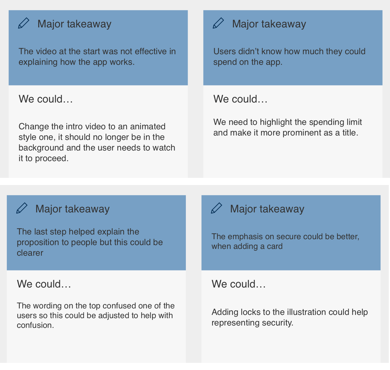
After conducting the test it shows that the video did not have any effects on the users and didn’t find this any benefit to on boarding. Showing that the approach of using video needs to be improved. The step by step process of seems to work well and changing the permissions to there own steps seems to work well with the users. The issue of getting people to always allow still remains and seems to be a general feeling amongst people with all app not just with Tesco Pay+.
To View the Test results of Design Phase 2 click the button below
Testing has not yet been carried out for this as the project got alot of its funding cut but im sure that the when the project gets additional funding this will be picked up again.
This a more refined version of design 2, changing a few things to the design to adapt to the feedback of Test to. The things i changed where making the video more of an explainer video and have the video not in the background making users watch the video. I did this as users didn't seem to notice the video in Test2 as it was in the background. The test was also to find out if video is an effective method of explaining the proposition. Word changed to try and point out unique selling point of the app as they were getting overlooked in a smaller text size.
To View the Prototype of Design Phase 3 click the button below
As a result we managed to identify why people didn't allow the app to have access to their location all the time. We boosted the onboarding add card journey by 10% as we applied the camera first approach to the existing app after our tests. We have got a refined approach to onboarding and if the work carries on, we will have an even smoother and higher converting onboarding journey. After conducting all the market research we have a list of components that we can use in the future that can be testing to get higher conversation this will help Tesco but also my self as i now have a great understanding of the onboarding process and the types of things users are not comfortable doing and that dont help with converting users to understand your proposition.