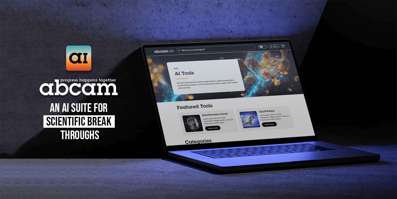


Abcam Limited is a producer, distributor and seller of protein research tools operating worldwide from 13 locations with 1,800 employees of which 400 work in Research and Development.
Abcam was listed on the Nasdaq and the London Stock Exchange until it was acquired by Danaher Corporation in 2023.


Abcam’s data team wanted to see what we could do with the advancements of AI in the biotech industry. So we set about seeing what we could currently do with our data and AI capabilities. This involved design a product out of our suite and also an apps store to house the newly developed AI applications.
When planning our course of action, my boss (the Head of UX) and I went to the office to develop a strategy for tackling the project. We used a whiteboard to outline the necessary screens and design elements to assist the development team. Please see the attached image for the results.


For the research phase of this project, I investigated various AI products that have gained popularity, such as ChatGPT and MidJourney. In Abcam's use case, AI will primarily connect different data points to discover potential new combinations of products for biological inventions. This was specifically applied to the Pathways Explorer application.
For the AI Appstore, I researched different app stores and their approaches to displaying products. I discovered the need for a store with multiple apps and a detailed page for each app, providing users with information about the application before they commit to downloading or entering the app.
The wireframing process differed from the usual approach as I worked alongside the development team with their basic MVP. The dev team was experimenting with capabilities in their tech stack, as AI is new technology. This gave me a foundation to work with, leading to the design below as my main structure.

For the AI Appstore branding, I ensured it aligned with the Abcam brand by using the Abcam gradient and the "a" in the Abcam logo. I also made sure the logo worked on both dark and light backgrounds.


The challenge with the entry points was that stakeholders wanted this tool at the forefront of the website, leveraging the search journey since 90% of users use this feature. However, we didn't want the new feature to affect the main sales funnel. This led us to reconsider its placement, ultimately deciding to test it with power users in the account sections. Feedback from this test would determine if we should place the feature more prominently.
For the Appstore design, I used my research and competitor analysis to create the layout. This also helped me decide what information to include, such as featured tools and categories.
On the App Details page, I incorporated a video component to provide an overview of the product. We would either commission a third party for the video content or use footage of users utilizing the tool. I also included a screenshot section, inspired by the Apple App Store, to give users a visual overview. Additionally, I added sections for how to use the tool and developer notes for further assistance. The Call to Action button was placed at both the top and bottom of the page for emphasis.


The UI for the Graph Explorer tool utilized the node system developed by our team while incorporating brand colours. This posed a challenge with colour accessibility, as the gradient was not the most accessible for digital use. I used the website's design system to align the Graph Explorer with the rest of the site.
Designing the nodes was challenging due to the various shapes and use cases. I held multiple meetings with the development team to understand the node system and consider design restrictions and capabilities.


The next step is to integrate this tool into the main user journey to encourage product purchases for experiments. If users find the tool useful for scientific breakthroughs, they can purchase directly within the tool.
I made this prototype with Figma. It shows the entry point of a user accessing the AI tools in through the Account area. You can see the app store and app details page this will also allow you to explore one app being the graph explorer. The idea is to allow scientists to visually combine different elements to create new strains
In this prototype its shows the entry point directly into the graph explorer app through the search modal. I used a tab component to not distract users from there main journey being search. With this method it will allow users explore the application if they wish to but also not to distract them from the main sales funnel.
The team at Abcam was pleased with the designs, and implementation began with the development team to enhance the user experience. This product set later became an offering included in the sale of Abcam to Danaher, a life science company, for a substantial $5.7 billion.
