

William Hill is a British gambling company headquartered in London, England. The business is split into two divisions, UK and International. They have various online products such as apps, desktop, mobile and tablet sites and a large retail holding of stores

The mission was to identify new customer needs when they first download the app. The main issue we want to overcome is making people understand how to navigate the app, place there first bet, register an account and make a deposit. I investigated various different methods of doing this as well as keeping in mind that the majority of users were returning customers so the approach could not be to intrusive to them.
I carried out an external audit for onboarding and first download experiences on the gambling and general app market industry to discover methods in which they onboard their customers, this included on how they deal with app permissions and make customers understand what to do to get started..

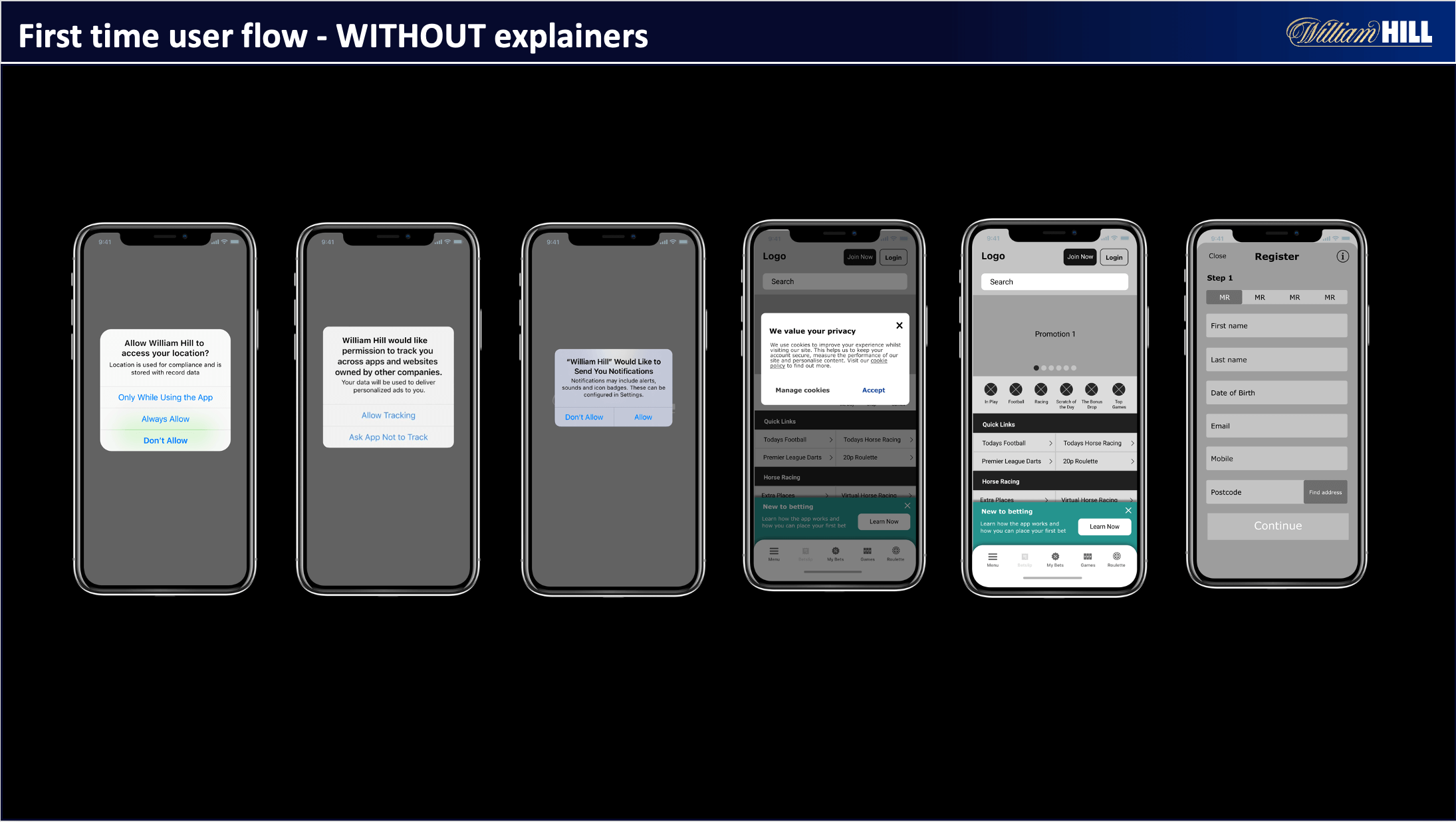
I created this user flow below to give a projected plan on how the first time user flow will work before actually designing screens so me and the product owners could easily visualise the approach before going into the design process

The first approach for the wireframes was to do various different design flows so we could get an initial approach for the prototypes. We wanted to create wireframes around if customers wanted to see explainers from app permissions and see what the results would be from this.


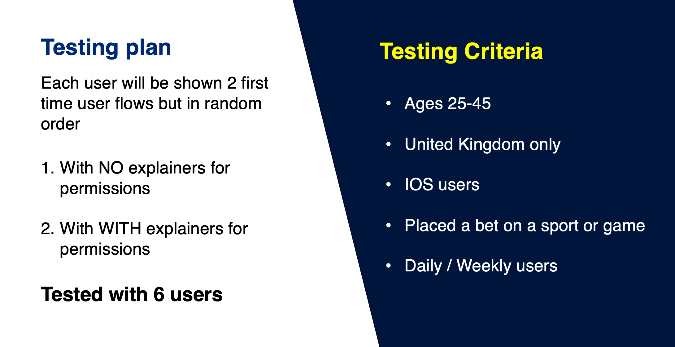
The main things I was looking for was do users like to have onboarding explainers over not having them, does it actually help them to have explainers. Do users want to make an account first or have access and set one up later. Do users want and onboarding process to see to understand what to do. What was the best way to show this.
After going through the testing process with 6 participants which I discovered that the interest to gain access to the app before having an account was of high interest and could even make users create and account after because they will be informed on how to bet.
When asking the users what they preferred they all said they would want explainers, BUT when watching the tests back user where less likely to gain access to the app as they the content would make them over think what William Hill will be doing with their information.
The pop up was much more effective with getting first time users attention and asking a question based around if they are new to William Hill help filter them from current users and new. The banner did not work so well to getting there attention as it was overlooked in many cases as people felt it looked like a cookie banner which they are used to ignoring on websites and apps.


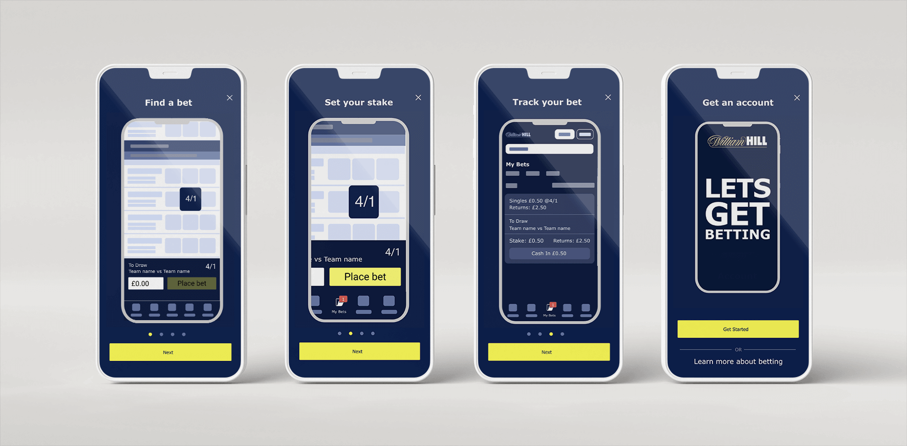
With the Ui design I started with creating them while prototyping the animations at the same time as I needed to see how I would the animation come together. I also analysed the current method of which a user’s places a bet, this to the main reasons to why the steps appear in the order they do. I created the graphic style the way I did so that it would be device agnostic and could be used on Web, Android and IOS devices.

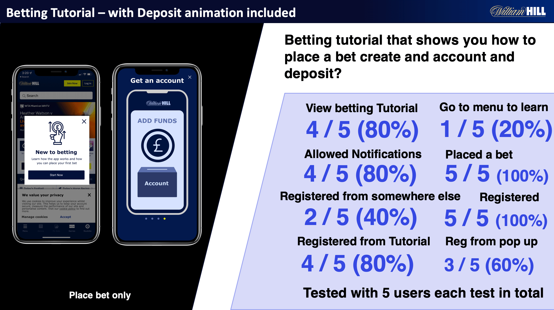
After the first initial test I then began to create different variations of the betting tutorial with which would try to find out what type of information would help people to onboard. I separated these into 3 types of tests. The first user test was testing if people were more effective at placing a bet with being shown how to place a bet. Then the next was to show how they need to create an account, then show them that they need to make a deposit. The reason I did it in these steps was because when you try to place a bet on the app and you don’t have an account it will ask you to register and then make a deposit. After watching the user tests, I could see that people would drop off at those points as they didn’t think they would have to do these steps. This was the reason I created animations for this as to inform them of what they needed to do. As you can see from each step test variation every time I added more explanation it improved the conversation rate

After the test results were gathered I went about creating the UI that would integrate the William hill style guide brand colours into the design. This also involved creating animations inside the betting tutorial to explain to users with infographics on how to place their first bet, set a stake, allow notifications, create and account and then make a first deposit.
I created the final animations in after effects to be able to export them to json lottie files. I did this so that the file size would be small so it would not take to much space on the app. I originally designed the animations in Figma smart animate but figma was limiting in allowing me to export these animations to Lottie so I had to recreate them in after effects. But hopefully by the time your reading this Figma will have integrated lottie into smart animate. Date create was June 2022.
After conducting various different user test variants. I concluded that new users who did not see the betting tutorial where less valuable customers and had a difficult time trying to place there first bet. The users who did see the betting tutorial had a much better understanding of how to place a bet, create and account and make a deposit.


After deliberation with Development teams, Design teams, product owners and stakeholders we set about getting this project into the build process and you will see this new and shinny onboarding process come into the William Hill Sports app early 2023. One of our tests for validating this was to turn on and off the explainers for permissions on the live app which proved the same hypothesis that explainers made users less likely to progress. The end results I’m sure will drive a large amount of users through the sales funnel with a well thought out approach with getting the least amount of fall of rate possible.
After completing this project i later found out that we won an award for Football betting operator of the year award. as you can see from the stats above i had a huge influence on the product for our digital product journeys and i am proud to be able to have an influence on where it has been recognised in the industry
