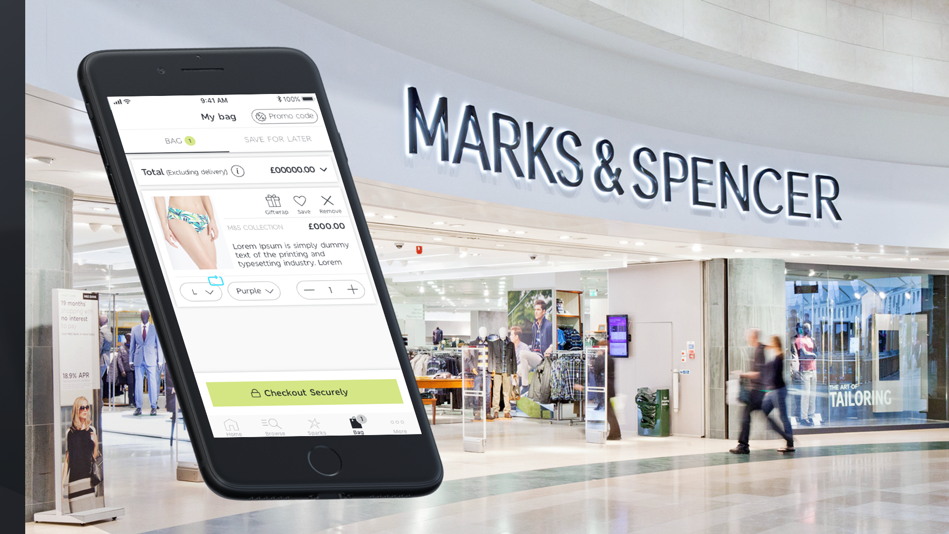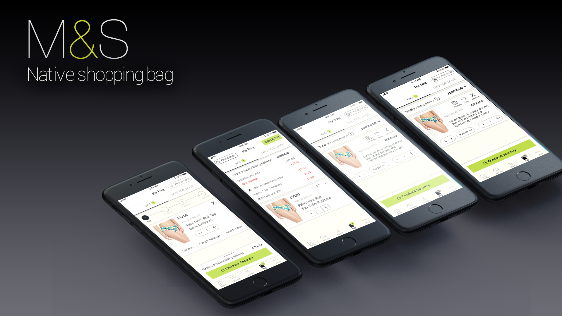


Marks and Spencer’s is known for their well-established supermarkets all around the world, they also have various different venue streams such as banking, clothing and a wide range of digital platforms to sell their products from.
The aim of this project was to improve the shopping cart / bag on IOS in order to achieve better retention and get a higher percentage of people completing their purchases. The data collected by the analytics team showed that the app checkout performed worse than the website, in terms of conversion by 7%. This showed that the current user experience on app was not having the desired effect. My aim was to identify how the website experienced differed from the app and how I could include native functionality to build upon this.
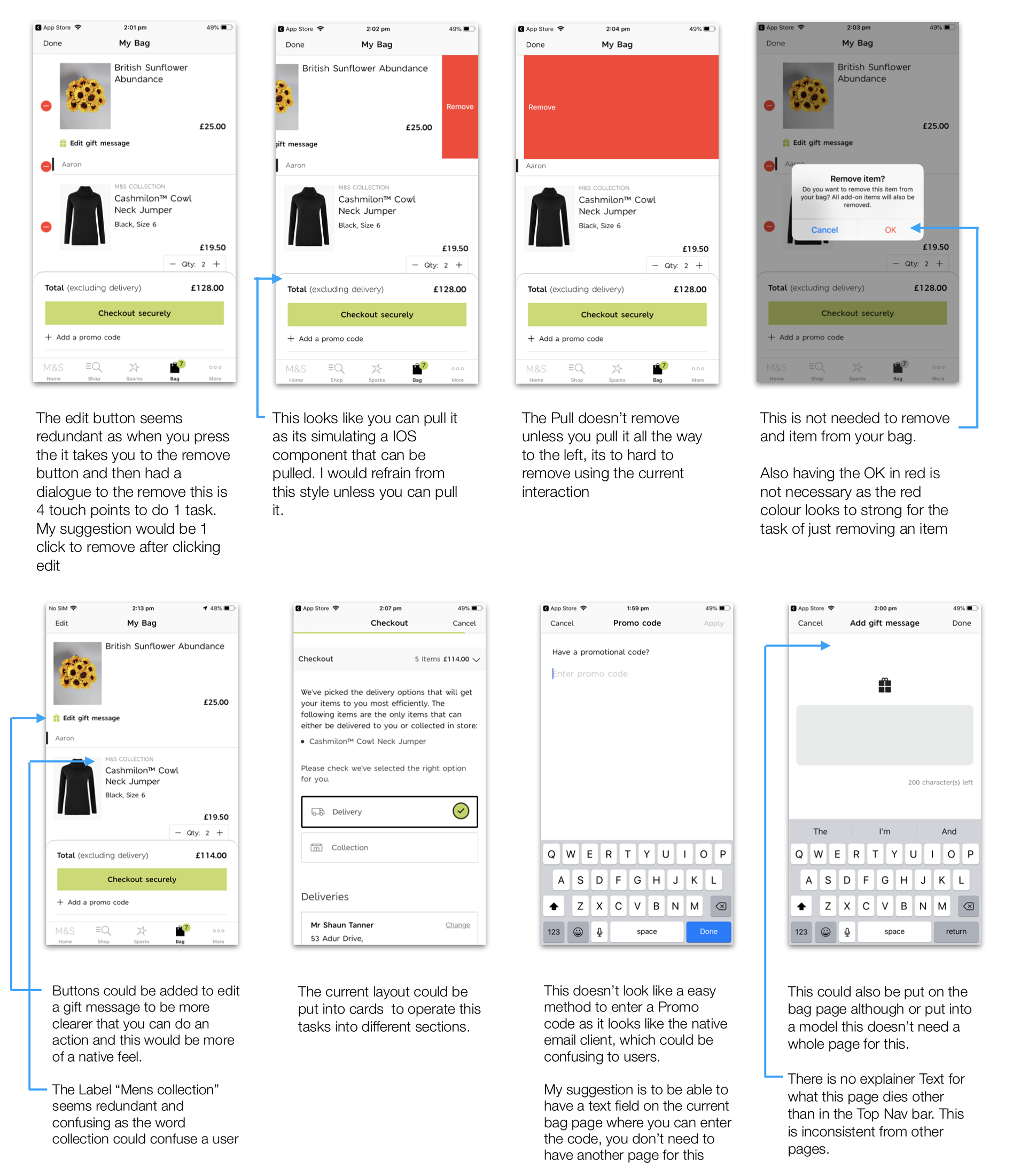
The current design
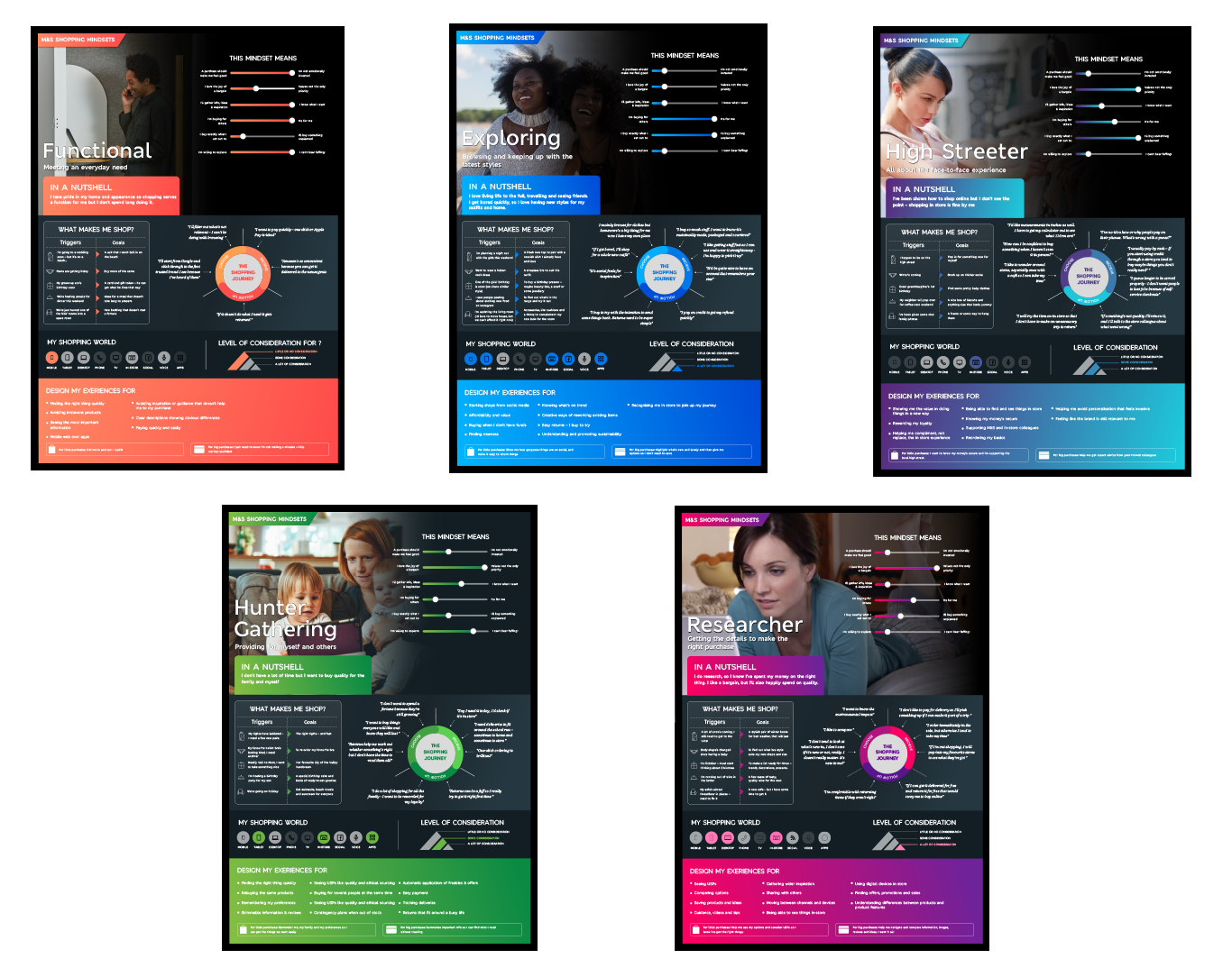
Please see the current user personas for M&S, these give insights to the different customers that they have. I used this information throughout the process when creating the new designs and always tried to keep in mind that I was designing for various different users and not just one.
My main focus was to see how other companies approached some of their user experience solutions around the native bag. Through observing all of these different competitors I could determine how others utilized good UX practices and how I could implement this in my design. I broke the research down into 23 different advantages of their design that I could potentially use to make various designs out off. Whilst considering native functionality and different interaction patterns. Please see full research deck by clicking the research button below.
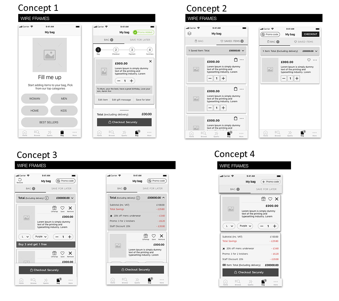
When wireframing design explorations I kept in mind the previous research that I had done, as I had discovered some great insights, which I felt could help with interaction around the shopping bag. I produced 4 different design variations so that I could explore different variations of interaction with the different features, in order to clearly identify what features are working well or not.
When prototyping I tried to get the interaction pattern as close as possible to the real-life product. This included the pull up and swipe down of the card, users can also add different offer cards into different sections. When adding your sparks card, I made the prototype simulate a user actually adding a card with their camera, I did this using Protopie to produce the prototypes. I used this tool as it allowed me to use a vast amount of native functionality for app.
This wireframe was to test if the progress bar at the top would help inform users that there are still various different steps before completing a purchase. And to show a method on how users can view more details about their current order in a pull up menu.
To use the prototype click the button below
This shows how when you take away the pull up menu how much space is created on the screen. I also wanted to see if people saw any value in creating groups in their shopping cart. This feature would allow users to group items and save them for a later date. The favourites feature is also created to see if there is value in adding this.
To View the Prototype click the button below
This wireframe explores a different style of product card, where you can scroll to see more details on what you added to the shopping cart. This also explores making changes to your order while it is inside of the bag.
To use the prototype click the button below
This is a combination of all three wireframes, this allows you to edit the items inside of the bag, add a gift message, there is also a feature that I created called restore. This is when you delete something out of your bag and you can restore it.
To View the Prototype click the button below
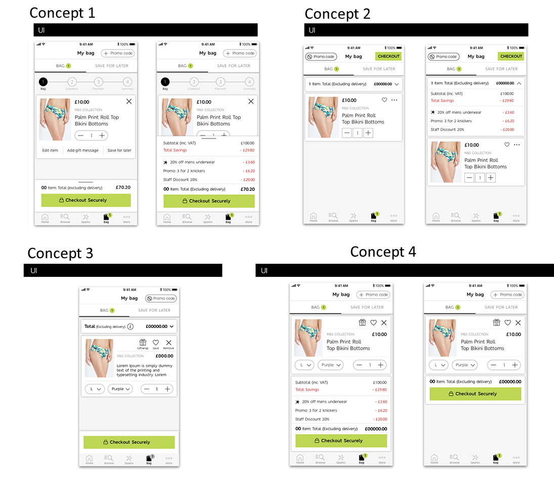
After the wireframes were produced, I started turning these into designed UI. This was very straight forward as I had made my wireframes in a high-fidelity format, so the transition for UX to UI relatively simple. I made sure that the design was consistent with the current M&S brand guidelines by using their exact font and colour palette.
Stakeholders were very happy with the designs produced but because of business priorities testing on this particular type of project was delayed.
