Overview
Overview
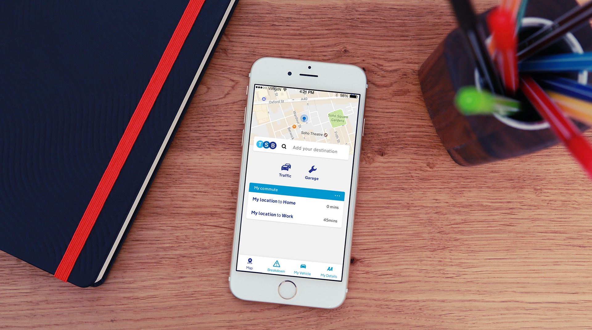
The TSB breakdown cover app is for TSB customers who pay for extra services such as insurance, home and breakdown cover etc. I produced the user interface and user experience for the app whilst working for the AA.
Project brief
Project brief
The aim of the project was to create a breakdown cover app specifically for TSB customers, which enables them to access their breakdown cover and receive roadside assistance through the app. The project brief required me to incorporate the look and feel of the AA app with the brand guidelines of TSB. Therefore, providing both familiarity for TSB customers and brand awareness for the AA.
Research
Research
Before I went about creating the designs for this project I undertook some research by looking at the different types of branding that TSB have such as the colours they used on their website, the types of application they already have in use, etc. This enabled me to gaged what type of product that they would be looking for.
Design
Design
iCON
When creating the icon I kept in mind the hybrid approach of incorporating the AA brand with TSB bank, this lead me to think of different ways to merge the two brands, after many design tweaks this was the chosen design.
UX / UI
When creating the UI and UX I kept in mind my previous research. This lead me to use similar colours to TSB had on their website, making use of blues, white and greys. I used yellow in this design to incorporate the AA branding. When designing the layout I kept it similar to the AA app as many of the features that are included in the AA were also wanted by the client, I also kept in mind that if we kept our app design similar to our existing templates this would lower the development time and budget spent on this project.
THE RESULT
THE RESULT
As a result, we won the bid to build the app which gave the App team an increase in budget and allowed us to build more B2B partnerships.
