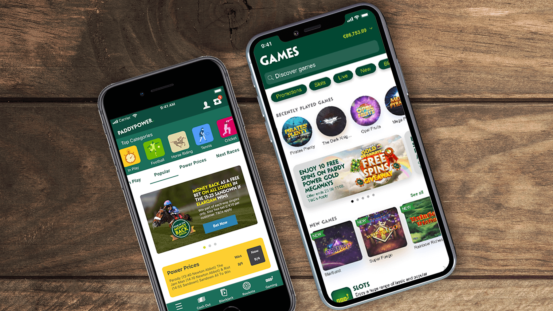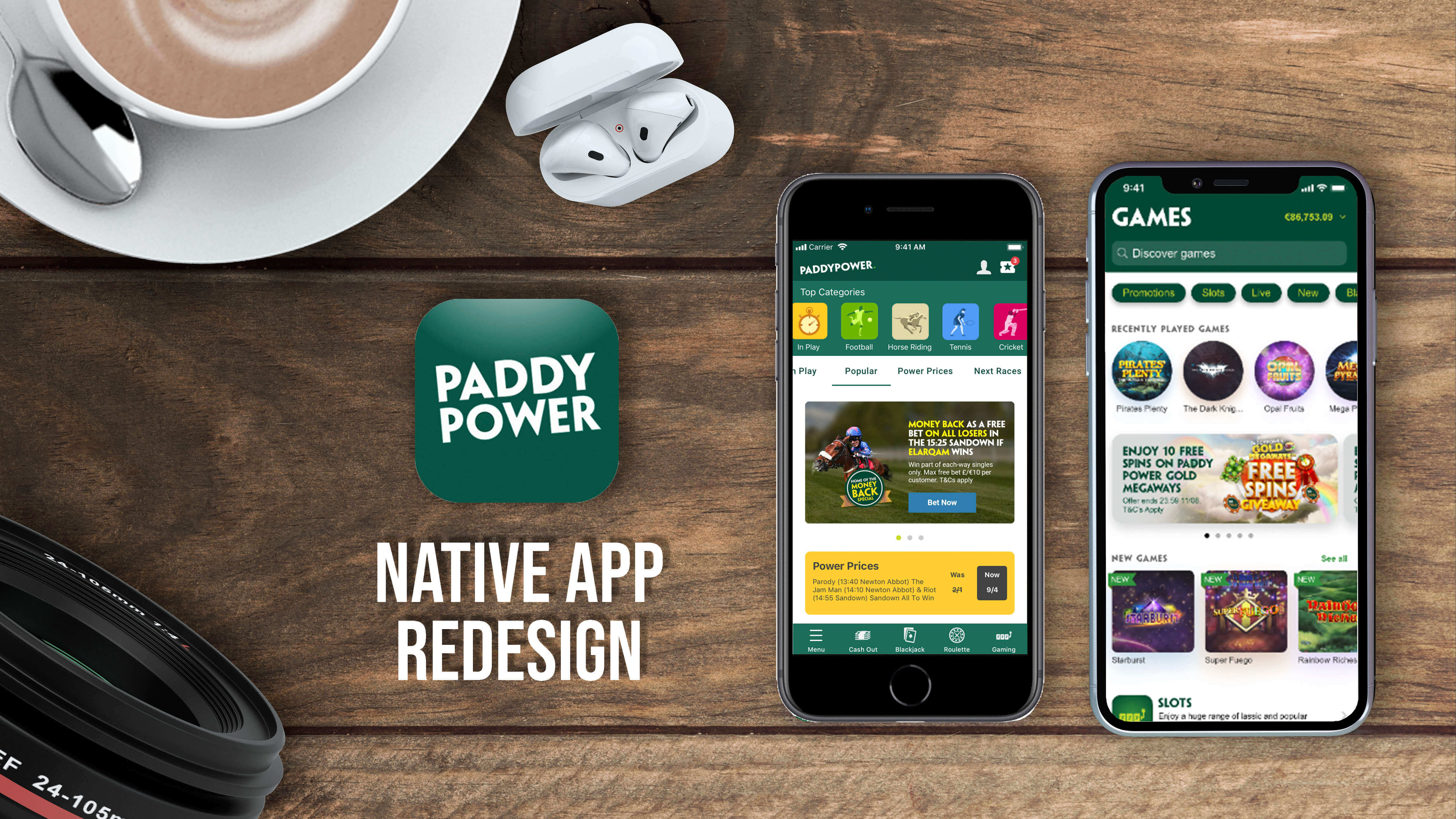


Paddy power is a sports betting site where you can bet on sports such as football, basketball, horse racing and much more.You can also play betting games such as roulette, black jack etc.
There current app has been getting rejected from the app store for not following the IOS human interface guidelines (HIG).
Rejections are as follows:
- The user interface is not using native components that fit apples guidelines
- The user of html 5 games is not compliant with apple
- The games store looks to much like an app store
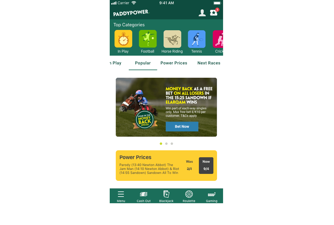
My UX review - by looking at the current app i can understand why the app has been rejected because of the nature in the way it has been built. After reviewing the app it doesn't have many native components, the app is basically a webview inside an app meaning that hardly any native components have been used and they are built in html rather than Swift or C#.
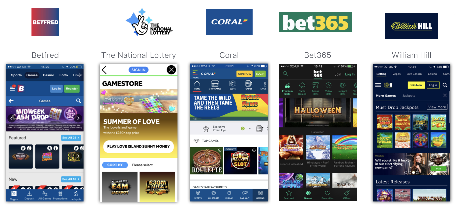
I did a competitor research to see what other people have done with their games lobbies and to see what type of native components they have used. This was just to get an idea of how other people are trying to solve the problem.
Please see competitor analysis document by clicking on link below
When looking into the components i took a deep dive into all of the apple guidelines and app store submission guidelines. This allowed me to make different versions of components that would give be more swayed to pleasing the current KPI’s of the business and others that would adhere to the HIG guidelines. The reason for doing this was because the business did not want to lose their current revenue model and where the will to put forward non compliant components if they met the needs of the stakeholders. This would be a risk but if it did get through apple strict submission process it would not affect their revenue.

When coming up with these designs I kept in mind that when the problem that needs to be solved was the app store interface being in the forefront, this is why i used different elements to hide the app store interface and give it a different feel.
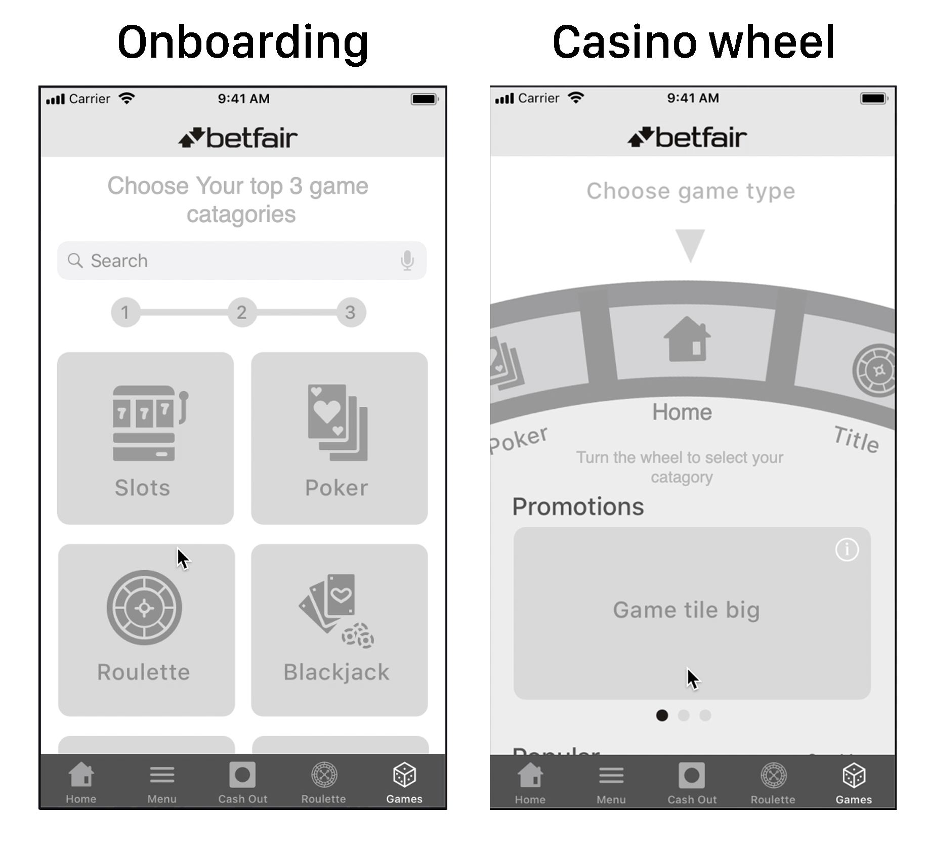
Onboarding content idea - This concept involved the user choosing categories which would then populate there home page giving the user a custom home page which gives it more utility which also make them more susceptible to other content. This also removes the app stor like interface as the first thing you see is an onboarding screen.
Casino wheel idea - with this design i used a casino wheel and put categories on the different sections. I used this for the user to be able to navigate around categories easily by doing this the content for a category would surface below. This was a unique way to navigate around the app and show content plus incorporate a betting theme. This UI was a bit out there in terms of naviation but at this point all options where on the table.
When designing the app i had to be very careful not to change to much of the app and try to apply native components when needed. There are various different web components used inside the app that I have reviewed and adapted to get them to a MVP for native.
Please see document with full breakdown by clicking on link below
For this home page prototype I incorporated native elements and changed various different components to reflect a native app, these being filters now use an IOS native component. The icons sizes changed to larger as the minimum icon size for this is 14px. Adding a pull out menu with native navigation. And much more.
The brief for these concepts was to incorporate native components into the app without to much of the behaviour of the app to change, so when approaching the design I kept that in mind. I used sketch to design the screens and Protopie to produce the prototype. This demo was sent out to the wider business to get a feel for what we will produce.
Please see prototype by clicking on link below
Prototype 1 onboarding design - When prototyping on this design I made a more refined interaction where you can filter and search using the native capabilities. This was the main prototype used during testing. We decided to use wireframed prototypes because of time constraints.
When prototyping i was told to take out the main elements that cover the app store interface as they wanted to test the usability of the UX, how ever i do disagree with this decision as the problem that needs to be solved is not the usability yet it is to be compliant with apple and these would be the elements that get used and could make us complaint. Although the decision was out of my hands.
Please see prototype by clicking on link below
Prototype 2 Casino wheel - When prototyping this design it was a bit of a challenge as it pushed my prototyping skills to the test as there was alot of drag interaction in this design and this involved me simulating some movement to reflect how the app would work if properly built
This concept was not fully finished as was told to stop development
Please see prototype by clicking on link below
The purpose of the testing was to see if we our new designer user experience would perform worse than the current app experience. We tested 3 new designs against the current design.
These where the tasks that we made the users follow
Please see prototype by clicking on link below

Overview of Test results - All new designs tested better than the current design proposition. And luckily mine tested the best with users with understanding how to navigate around the prototype and felt comfortable using the native components within the app as this was something they were used to. Please view the Test results document above for full results of test. This test was carried out by a different user tester.
The UI design was then sent of to another team within Paddy Power who carried out the UI deisgns. I had to leaise with them to make sure they stayed within the apple guidelines. This did prove harder than it looked as alot of the designers didnt know much about the guidelines and where used to making websites, so they where using components with inproper use which could cause a rejection from apple. But in the end we got it to a standard where it was following the apple guidelines. Although the rejction we had previously was looking to much like an app store so hopefully this doesnt fall into that category, although there is a big chance of that.
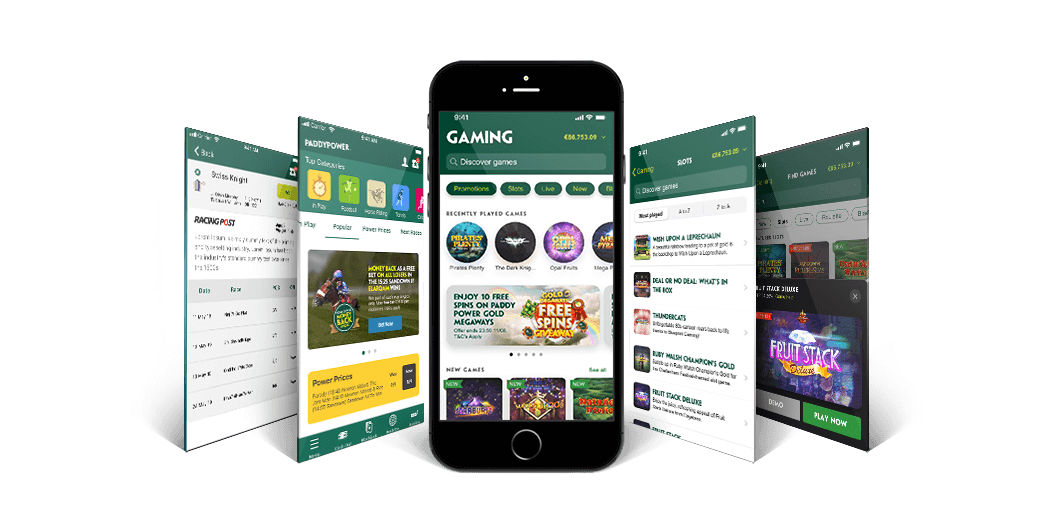
In terms of solving the problem and making this app native i have done what was asked from the stakeholders and completed the requirement. Although if there was not restrictions from stakeholders i would suggest that the app needs to be redesigned completely with the user at the forefront of the experience. Because the current design is not user friendly and could be a much better experience.
