Marks and Spencer’s is known for their well-established supermarkets all around the world, they also have various different venue streams such as banking, clothing and a wide range of digital platforms to sell their products from.
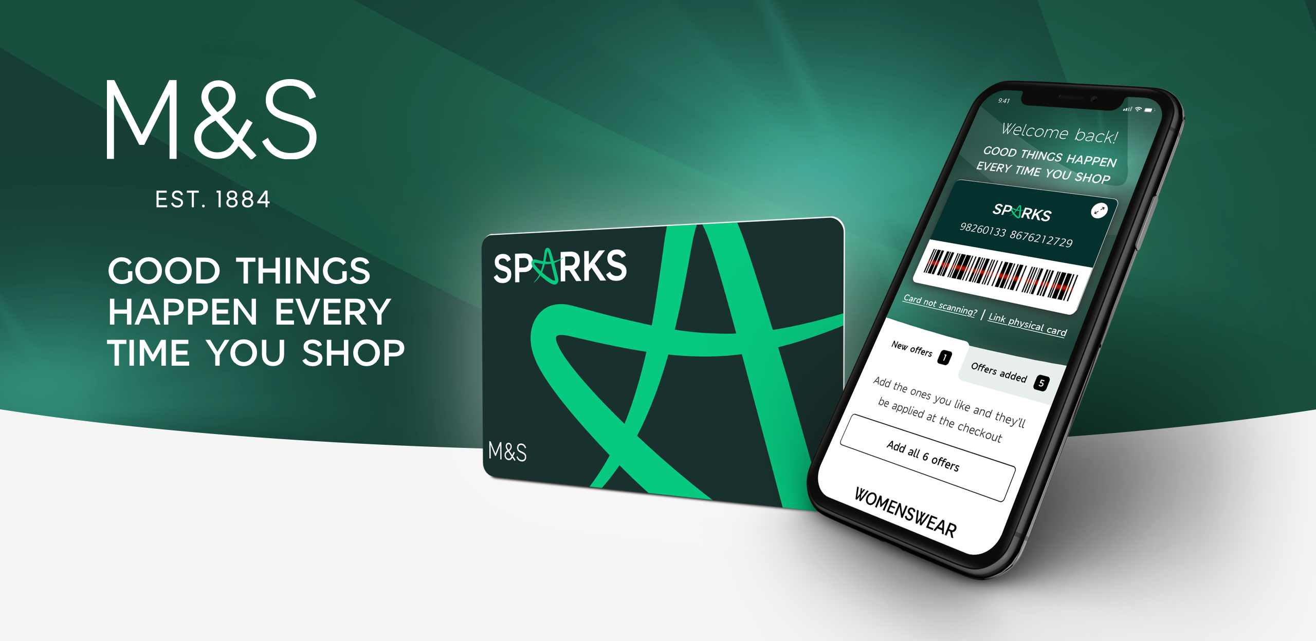
The Aim of the project was to totally revamp the SPARKS loyalty scheme by giving it a fresh new look and to introduce new propositions to its customers. The reason for this change was due to customers expressing their opinions on the lack of value in the current loyalty scheme. Thus, my aim was to try and change how users viewed the loyalty scheme by conducting research on their views of the loyalty scheme and what Marks & Spencer’s as a company could do to improve these. One of the major changes to the Sparks project is the new branding and the removal of SPARKS points which the stakeholders were keen to remove.
The current design
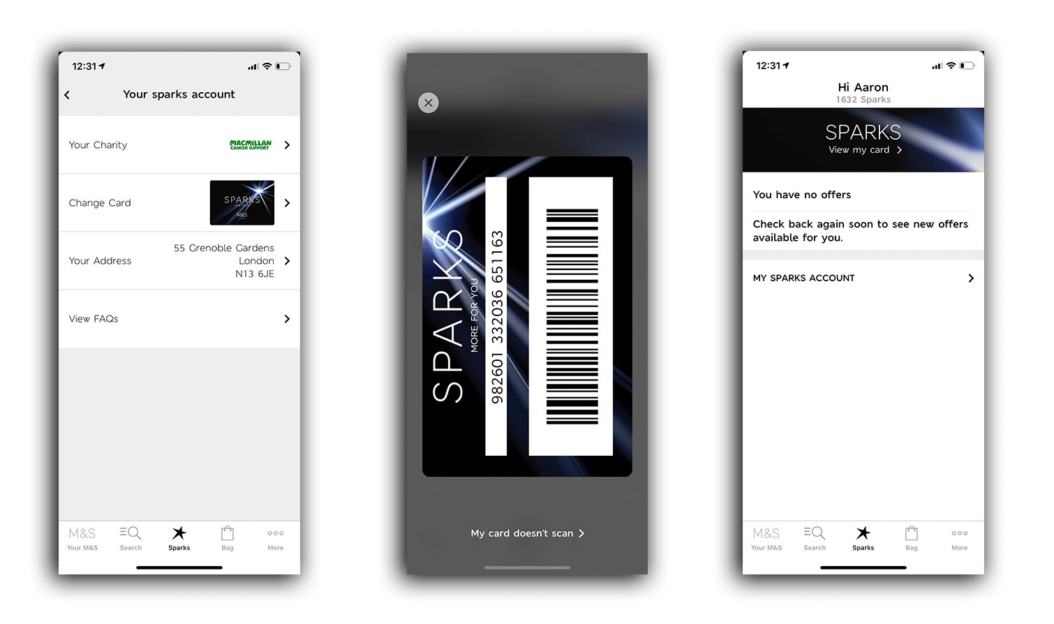
The current design allows users to scan a digital card, add different offers to their sparks card and donate to charity. It consists off a loyalty points system that you can use on offers or/and donate to charity.
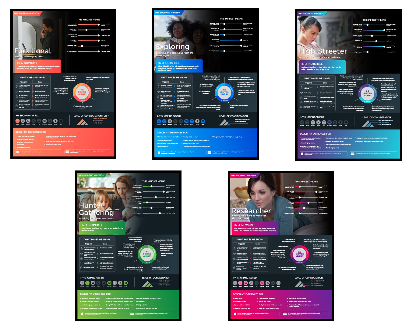
Please see the current user personas for M&S, these give insights to the different customers that they have. I used this information throughout the process when creating the new sparks hub and always tried to keep in mind that I was designing for various different users and not just one.
The research for this project was carried out by an external agency, that I helped manage throughout my time on this project. They conducted various user interviews and initially did some customer journey mapping. From their research it was discovered that points where not favourable amongst the M&S customers, which led the stakeholder’s wanting to remove them.
This user flow was created to give an overall service design on where and how the new sparks proposition fits into the M&S brand. Therefore, showing the different user cases, my part of the user flow is for the mobile app experience. I helped create this with another designer to show what touch points are required inside of the mobile apps.
When designing the wireframes, I had to keep in mind that native functionality will be slightly different from the web versions. As I was designing these wireframes alongside web designer I had to liaise with them to see where are journeys would be different. This also involved working with a design agency who did the user interviews previously.
During the wireframe stage some of the stakeholders wanted to see some different variations that broke away from the current wireframes to see if we approached the design in the right way. This arose as the design agency that we were working with were leading the design of the product and the stakeholders within M&S wanted to test their design solutions. This lead me and another design to come up with various different concepts that we felt would be a better user experience for the consumer.
After a large amount of design changes to the user journeys from the wireframe stage. We finally landed on the final designs. The Branding for the new SPARKS cards and logo was produced by another external branding agency. We used there branding to style the UI around this. The ideas for this was to show case the new and improved sparks card and try and entice the user into interacting with the new brand. I used Sketch to design and Zeplin to hand off the design to the developers.
This new design is to merge the Sparks account holders with the M&S account holders, which would act as a unified sign up to give a better user experience when using M&S products. We had to consider the legacy users would have a different experience when logging in. This led to the designs to having three different entry points and scenarios.
The new sparks hub is designed to show case the new sparks card and make it a more native experience for mobile. It now has all points removed along with a new onboarding journey and fresh new UI. The interaction patterns I used for this design utilised the native functionality for app. It also has a wide range of functionality to add the offer cards and section up the charity incentive. It allows you to add older and new sparks card and to add the sparks card to your apple wallet.
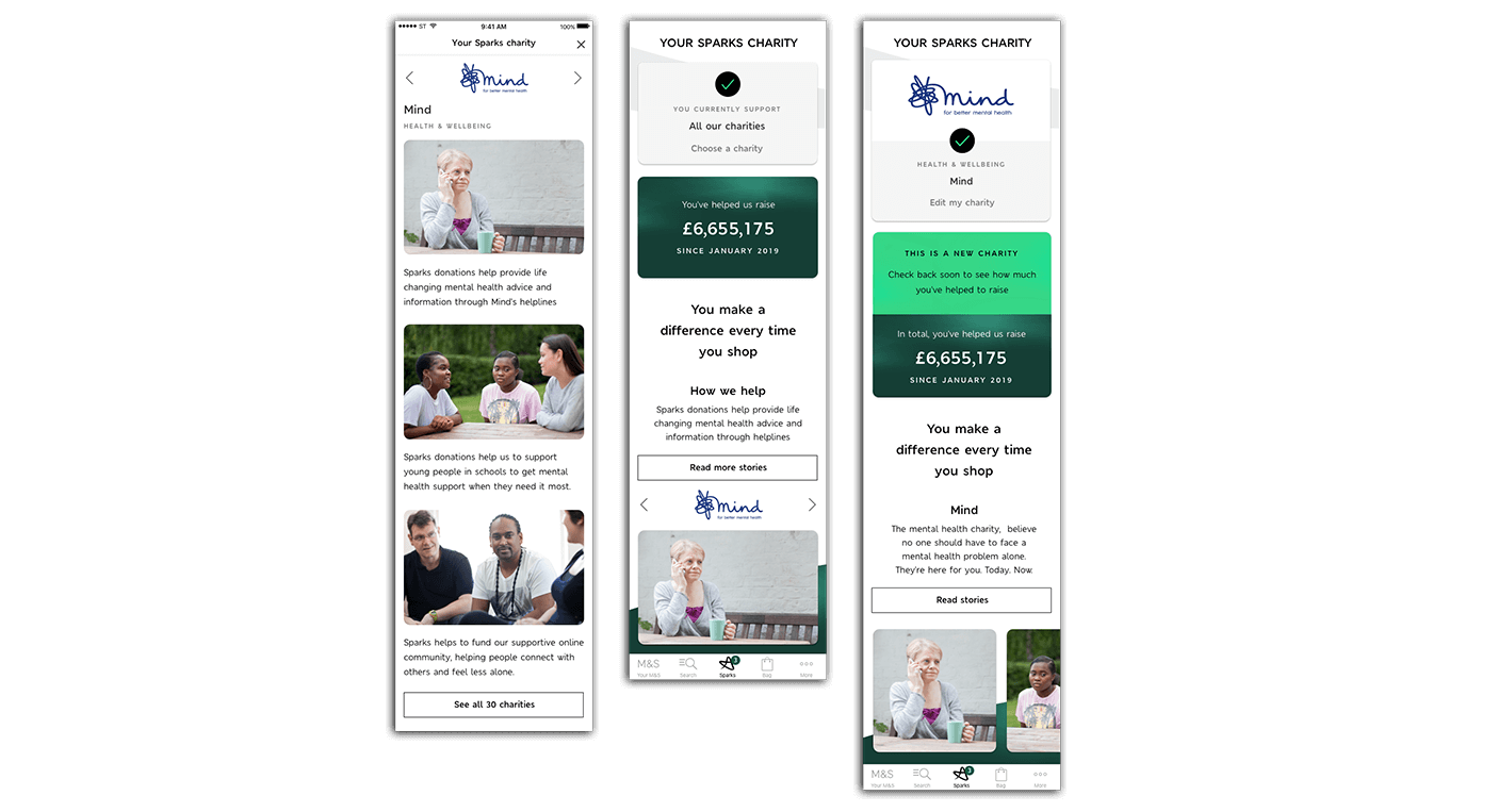
The charity section had a lot more work done to it by adding an additional 30 charities to the section. This now allows users to donate to multiple charities and just one if the user wished to.
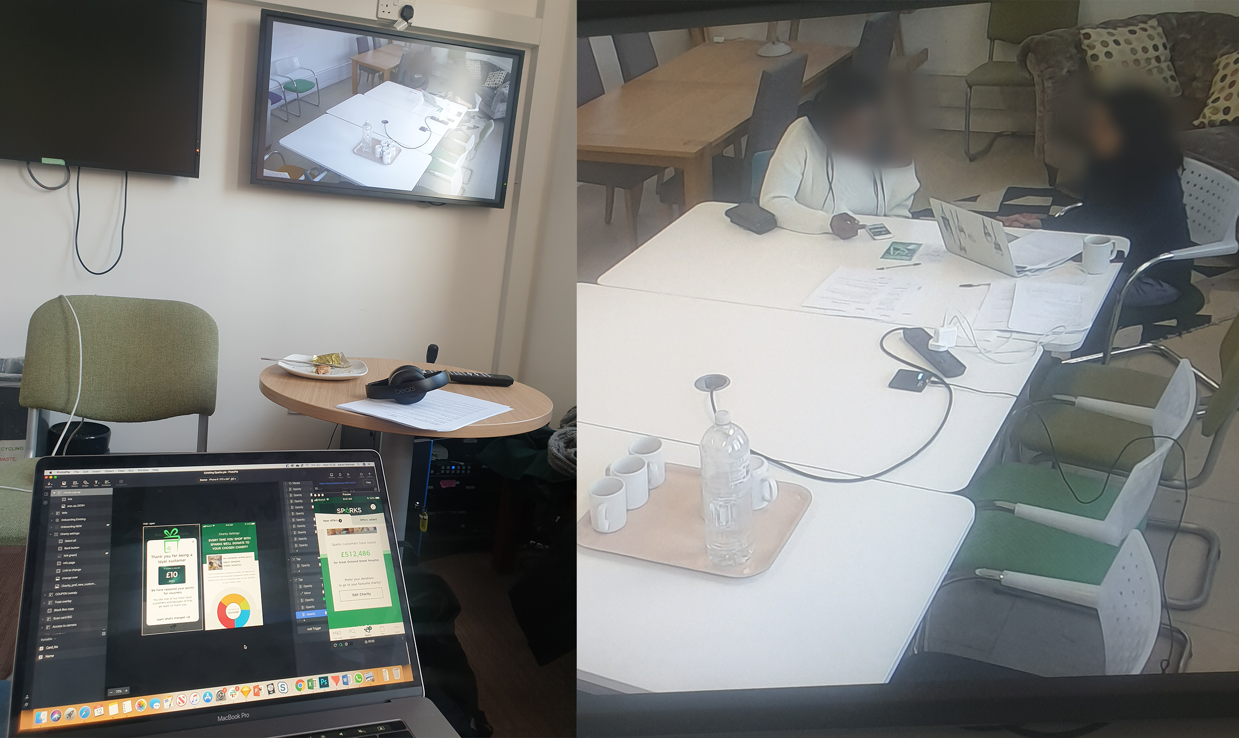
When prototyping I tried to get the interaction pattern as close as possible to the real-life product. This included the pull up and swipe down of the card, users can also add different offer cards into different sections. When adding your sparks card, I made the prototype simulate a user actually adding a card with their camera, I did this using Protopie to produce the prototypes. I used this tool as it allowed me to use a vast amount of native functionality for app.
For new users they would see a registration journey so they can sign up or login. Customers would only see this when they have first downloaded the app as we don’t know if they are a customer with an account yet.
To use the prototype click the button below
For an existing M&S user who has not opted into the Sparks Loyalty scheme they would need to opt into the SPARKS loyalty scheme before using. The app would already have all these details because it is stored for the user. The user would only have to tick a box to gain access to the proposition. This also keeps in line with GDPR regulations.
To View the Prototype click the button below
An existing sparks customer will be greeted with a new Sparks experience straight away but still have a new onboarding journey to show them how the new UI works and to inform them what has changed about Sparks.
To use the prototype click the button below
In user testing the 3 prototypes I made where tested with the general public we tested with various different user personas. I sat through all the participants and got some great insight when it came to the overall proposition and user interactions. After testing this led, me to change some interaction patterns as I was seeing the younger generation swipe and the older generation tap. This was something that has made me try to incorporate this type of thinking to all of my designs in future. Over all the testing of the product went very well although there were some users who were not happy about the removal of their points. Which to be honest I was expecting with such a loyal customer base. Please see the final testing document below. All user testing was done by a user tester in control lab environments.
To see the full user testing report click button below
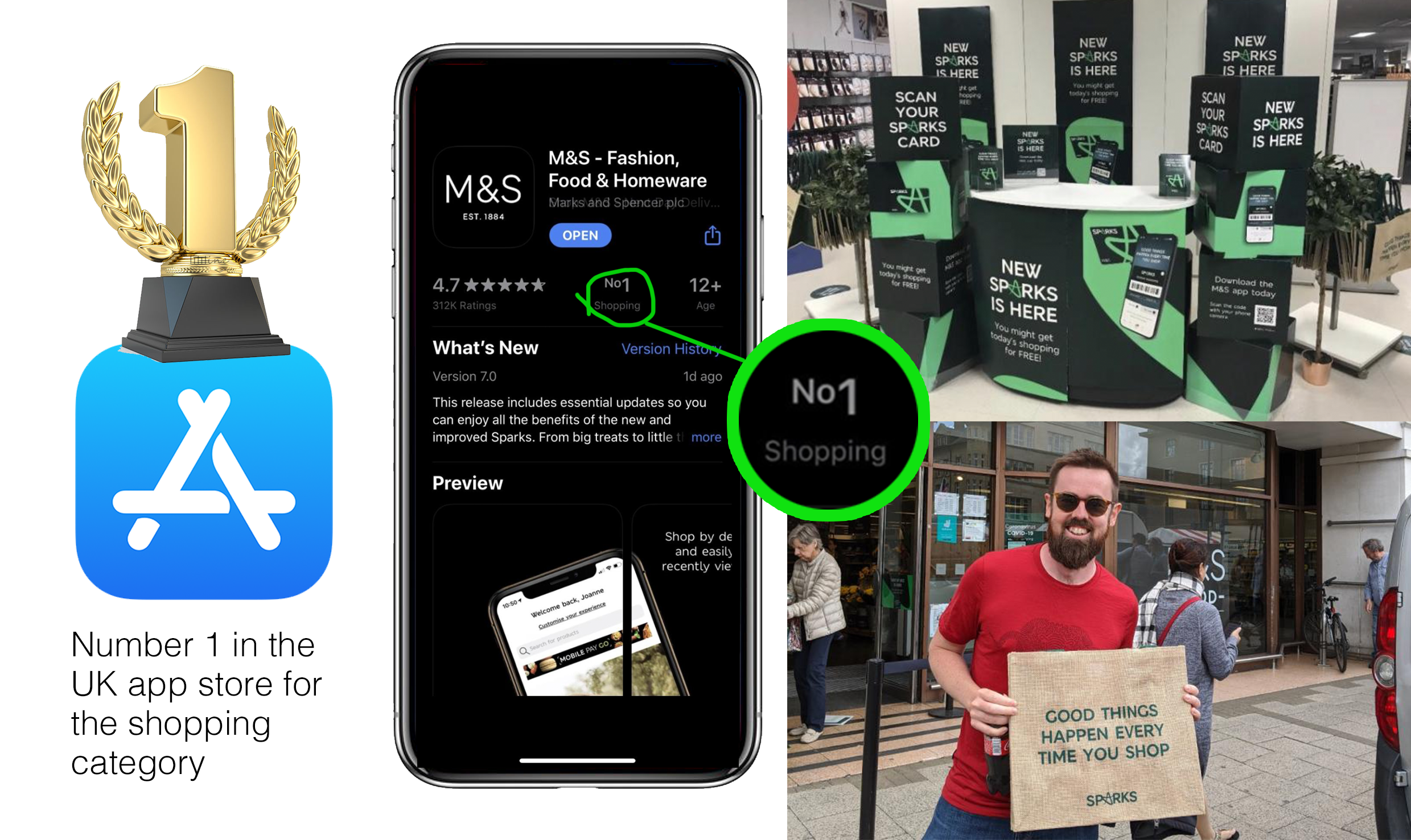
The project was successfully launched to the public and well received by the 7 million users on the mobile app. This led the app to go to 1# on the UK App store in the shopping category on both Apple and Google play which lead to even more downloads. The stakeholders where very happy with the results and have now changed their business objectives to have an app first approach as they have seen the power in the business that can be created through this channel
This project made me extremely proud and was a pleasure to work on. I feel that the fact that I made an app go to number 1# is something I can take forward in my career and I gives me confidence in my design ability. The M&S app was originally 13th place in the App Store.
The end result was that as a team we worked together to revamp one of the UK’s biggest brands in a major way. Me and 3 other designers where the key creators of this and I feel proud that I can be one of the people who will change the face of M&S as we know it. It was a real pleasure to work on this project and push it over the line to get a great looking product that will interact well with its customers. I also produced all of these designs for Tablet also please ask if you would like to see these.