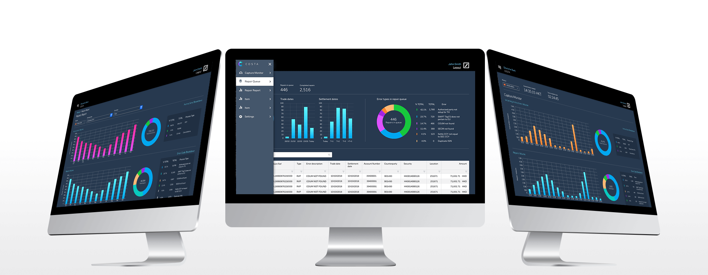


COSTA (Custody operations securities trading application) is a trading platform that deals with issues that occur in the trading process. These issues will need to be solved by an operator.
The aim of the project is to migrate a 20-year-old system stuck in the dark ages to a bright new UI interface that updates the current process to automate outdated redundant processes.

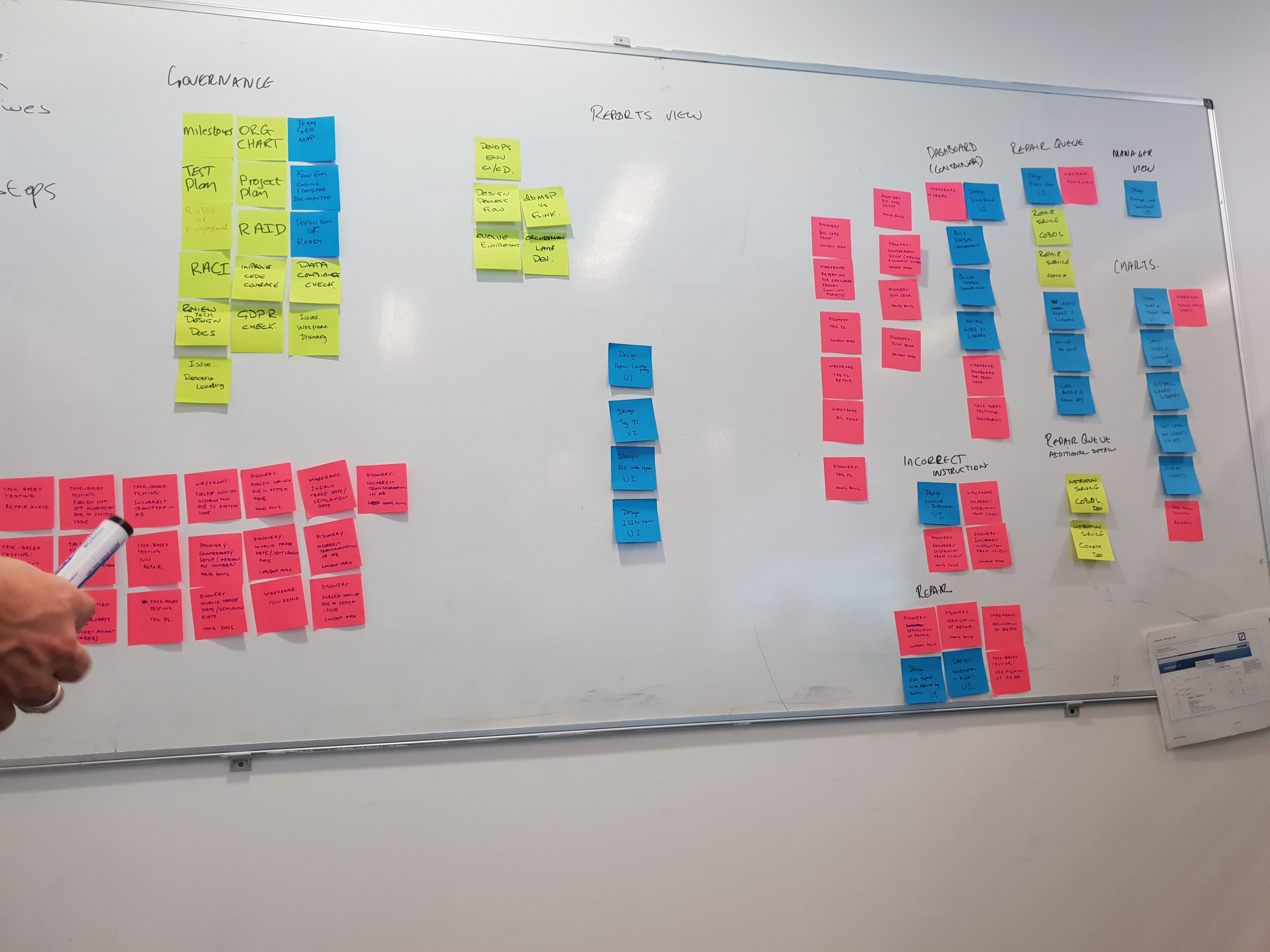
User interviews - The operators of the project are based in various different countries such as India and Singapore, we scheduled weekly calls with the users to understand their process and how they went about fixing an issue and the types of fixes the most commonly arise, The problem arose when different markets solve the same issue with a different method.
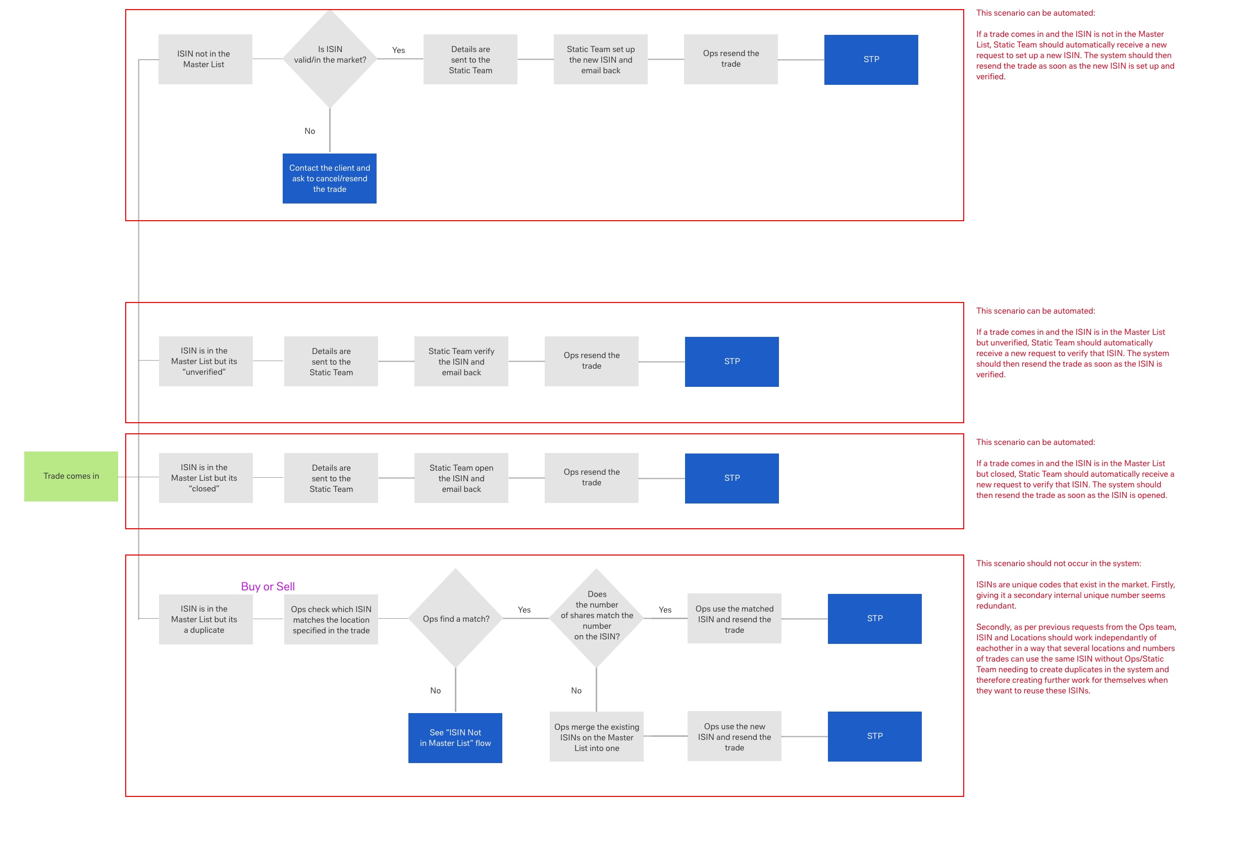
The user flows where created to see how we could illuminate redundant processes, this allowed us to share this information with the users to see how we could add value to them.
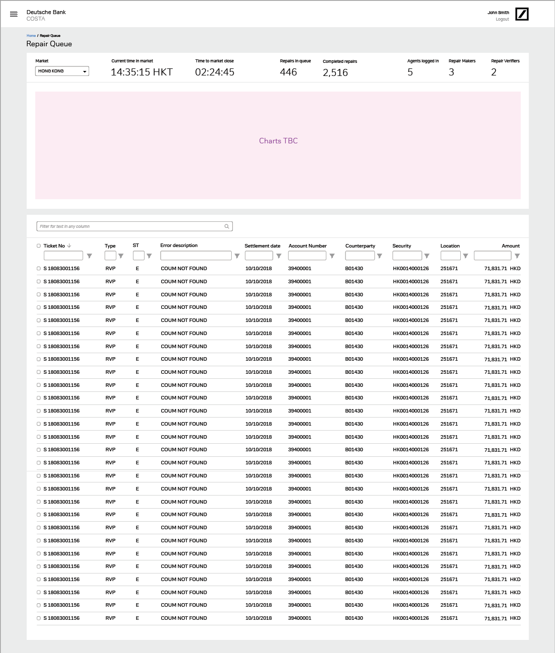
The wireframes where created after a large amount of the user interviews we carried out, the reason for doing this was because we needed a sufficient amount of information before visualising the data layout.

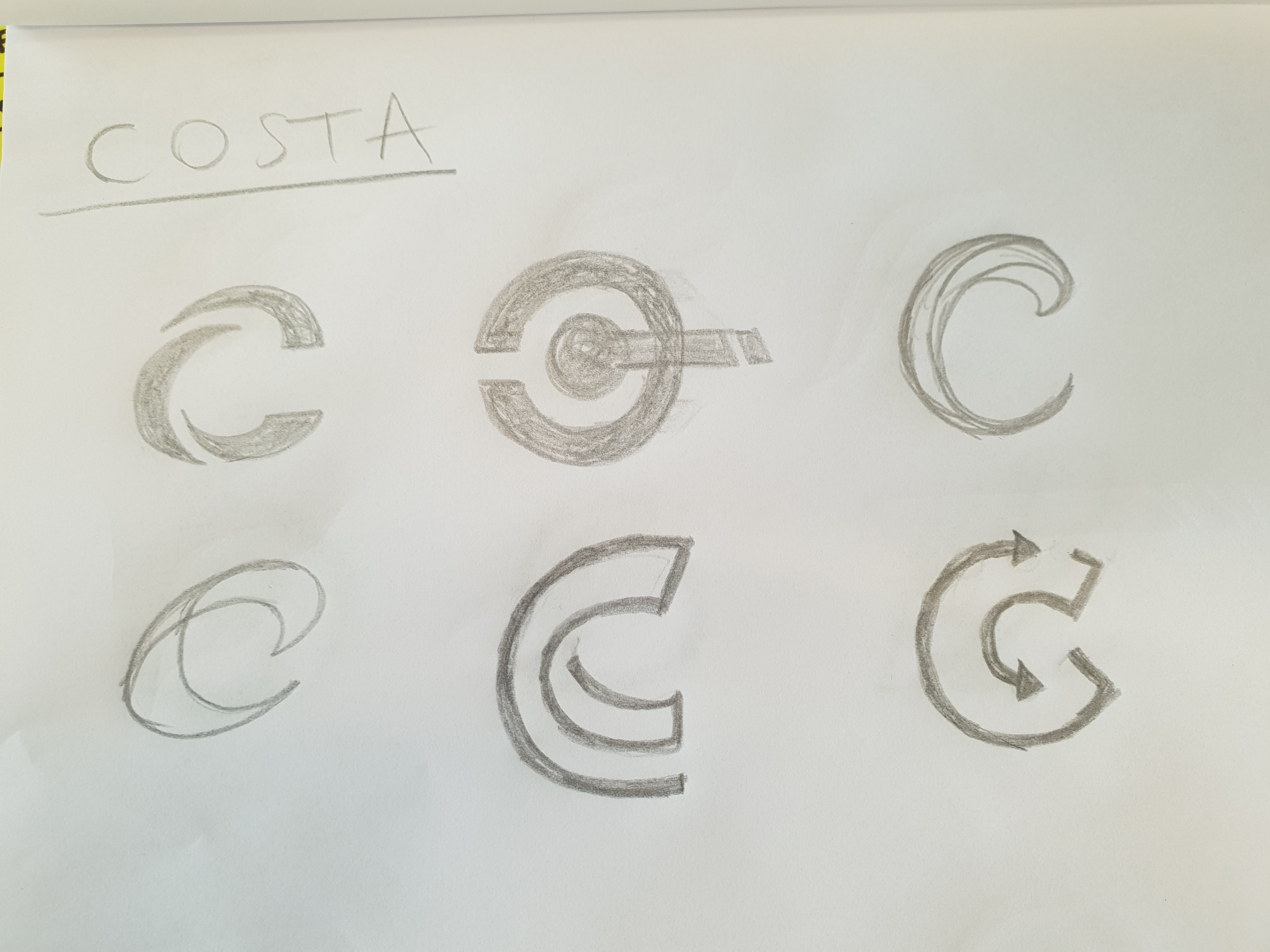
When branding the project i had to keep in mind that the project consisted with a large amount of data incoming and outgoing, the branding also had to stand out from the dark colours that Deutsche bank use. Firstly, i went about this by drawing some concept logos and gathering some concept branding to see what the client wanted, this gave me overview on what type of design they were looking for.

Once I came up with some concepts I showed these to the stakeholders who guided me to what type of design they liked, I then proceed to design 3 concept logos that represented the brand the best, for these three we chose one that went on to be the chose logo.
When designing the UI i based this from the wireframes, I was in constant contact with the lead developer with the project. We worked together to make a design that was easier to build using existing component libraries, for this design i used PrimeNG for the data visualisation and site layout. I used AGgrid for the data table. as this allows users to filter with ease and it is used in many Deutsche bank projects.
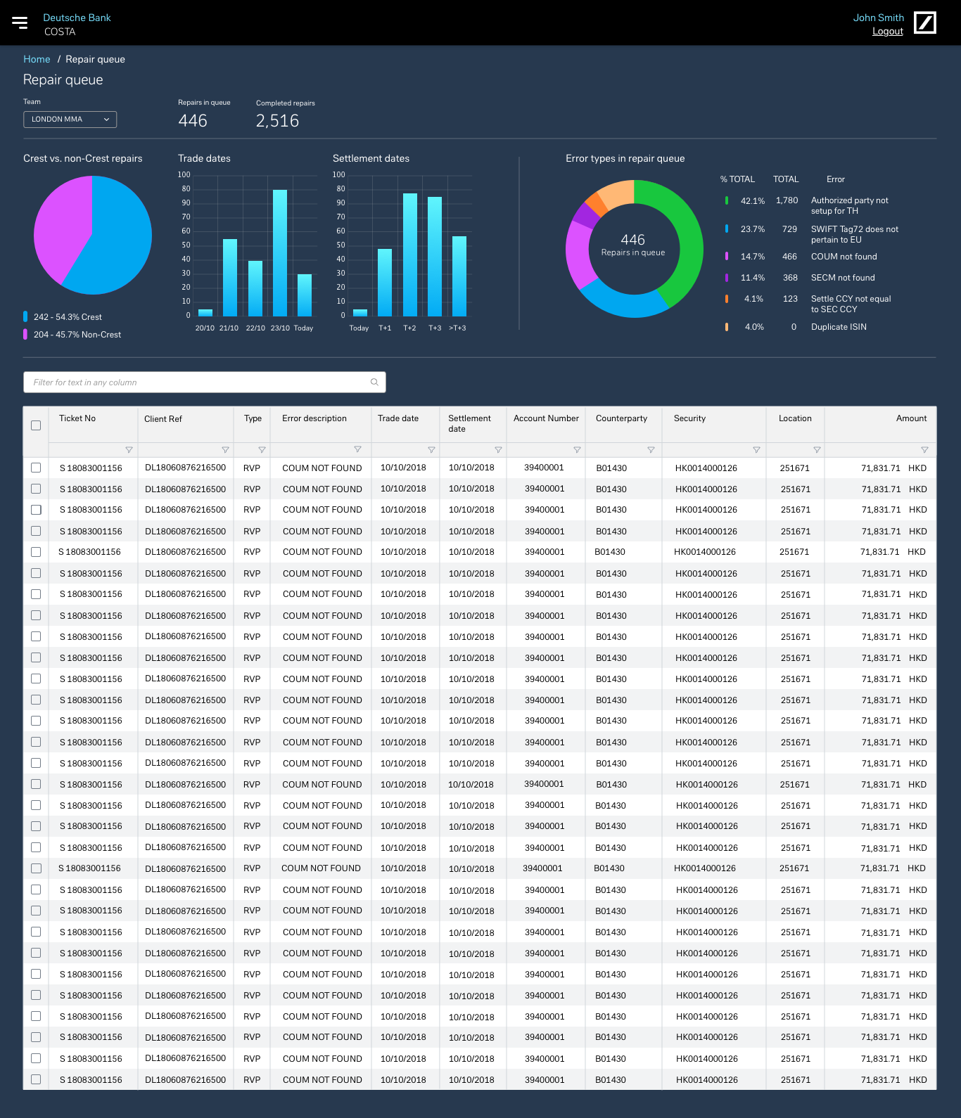


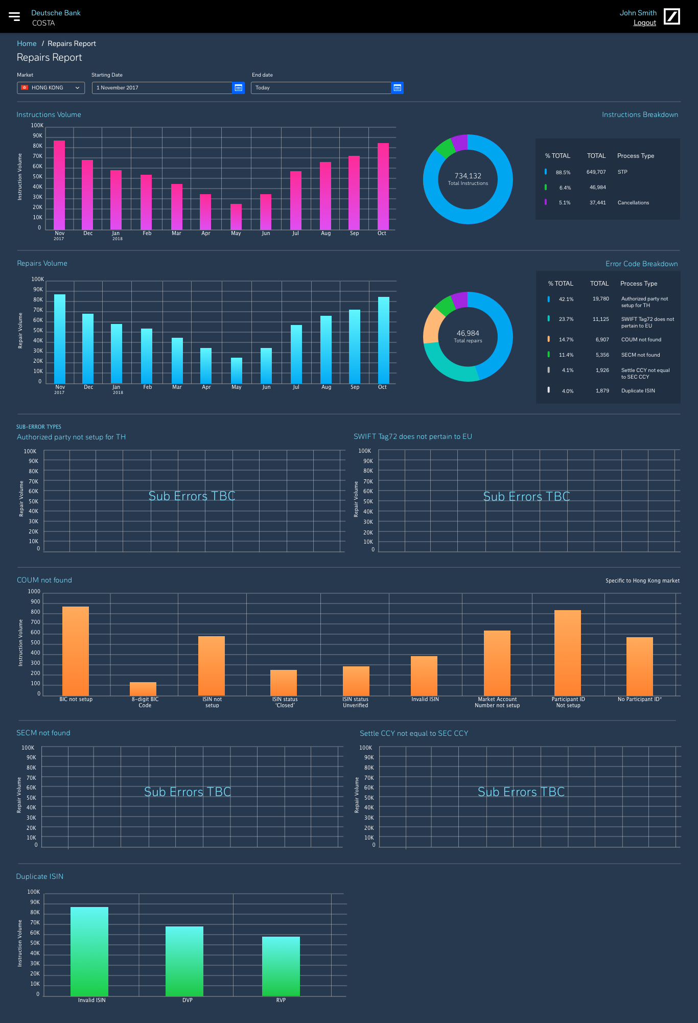
As a result we helped the users have a better user experience making their jobs easier to do. Giving them charts allows them to have a better overview of what is happening. By updating the UI and UX it has allowed for users to have use of ease. By automating a lot of the repairs and processes this have been cut out and this will allow Deutsche bank to cut costs by having less work force.
