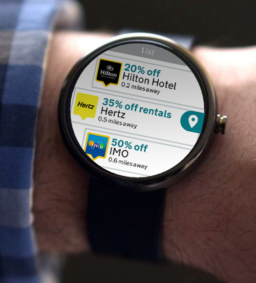


The AA watch app, is a wearable application that assists AA customers with regards to providing them with a list of benefits, provides services such as setting parking timers, show vehicle details and enables them to control their push notifications.
The project brief required me to recreate the AA app for mobile devices for android wearable devices.
The first task involved me becoming familiar with the wearable device, as this was my first attempt at producing a wearable app. I download other competitor’s wearable apps such as Uber, Google maps and City mapper, in order to help me get a better understanding of what other companies have produced and how they dealt with user experience issues. The challenge was to try and give the same capabilities as the normal app devices but because the device capabilities are much more restrictive on a watch this lead me to figure out the best features to include on the app without restricting the user experience too much.
When designing for the watch I kept in mind the size of buttons, as I could not make the content and UI to small as it would affect how the user would interact with the app. I had to make sure that the font size was also bigger than the mobile device font. The challenge with the design of the watch is that most of the user interfaces are designed in dark colours as this saves the battery life on the watch, but due to AA branding guidelines I had to use a white background. This is however one flaw within the app design as it could cause the app to drain the devices battery life.
Below you can my user journey design. After researching other applications it was clear that I had to cut out certain features, from the mobile app, such as reporting a breakdown on your watch. As this is not as simple as just calling for a breakdown, as there are many factors to consider such as tracking the GPS from your phone and data entry when reporting this, which the wearable technology is unable to do. The features I did include where the most used features on the mobile application such as customer benefits, parking timer, etc. Thus adding value to the customer.
When designing the watch application I worked closely with the developer, as this was both the first time we built an application for the watch so we had to experiment with certain features, such as button sizes and QR codes.

The stakeholders where pleased with the progression of the App team, this lead us to be able to extend our reach of the AA on mobile platform services, allowing our accessibility to new markets to gain wider reach. The application is now in development and should be release before the end of 2018.
