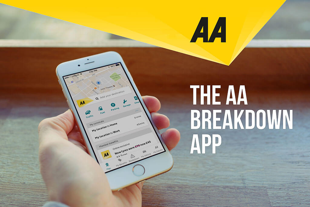


The AA app is a breakdown recovery app to assist customers with their vehicle breakdowns, you can also get customer benefits such as discounts, store and update details about your vehicle.
My aim on this app was to make the user experience much better than it currently was, my mission was to try and find the gaps where users might get lost on the app, this is an app for IOS and android.
Before starting on any design work, I would look into what other competitors had created and what solutions they done to solve a problem. The main apps I looked at where for navigations and mapping solutions where Google maps, Waze and City mapper. For Benefits features I looked at the apps Groupon, Wowcher, and Datpiff. I looked at these because they helped me better understand how to cross sell products and services for the overall User experience, I looked at Facebook and twitter to see how they layered out some of their settings menus.

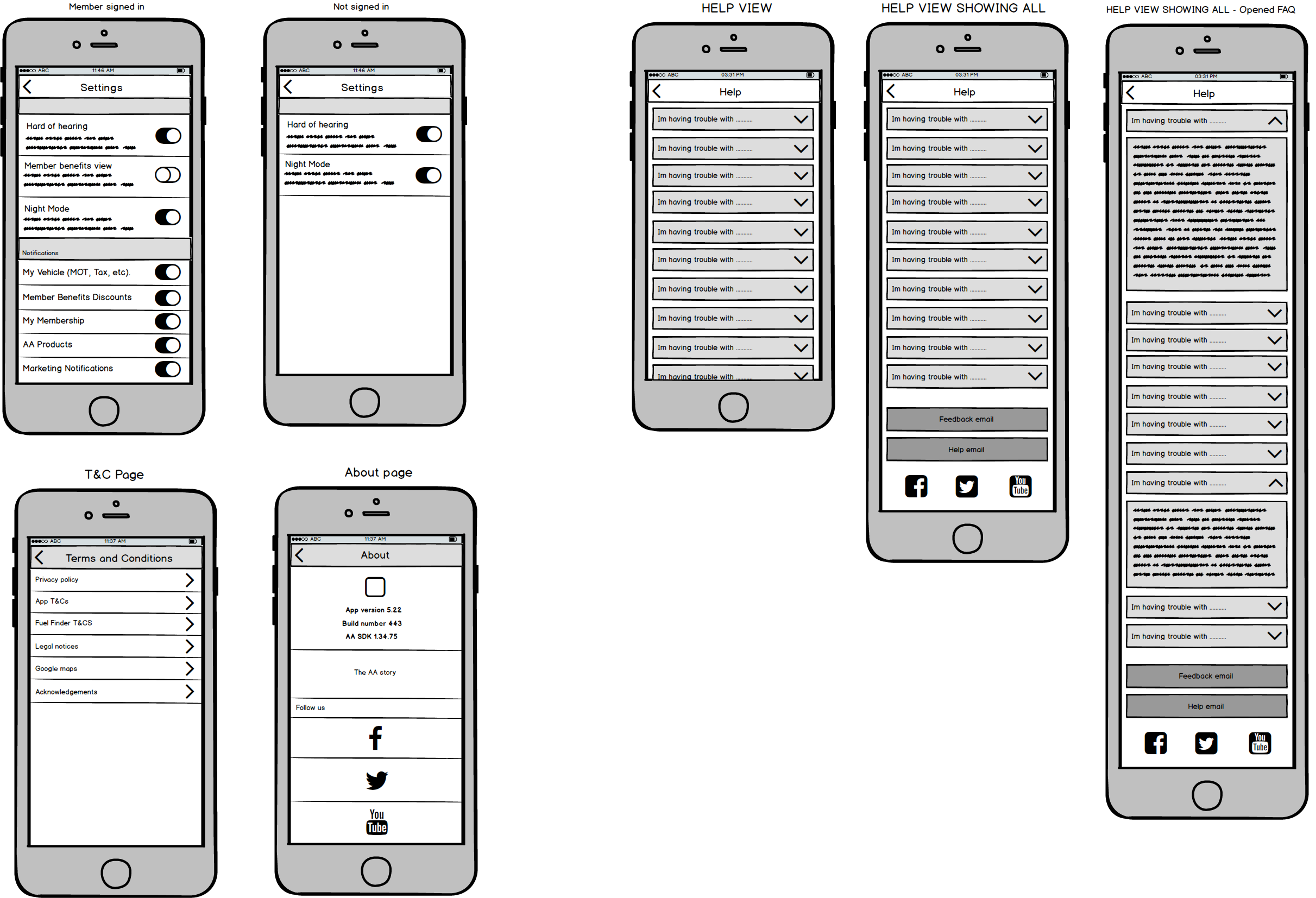
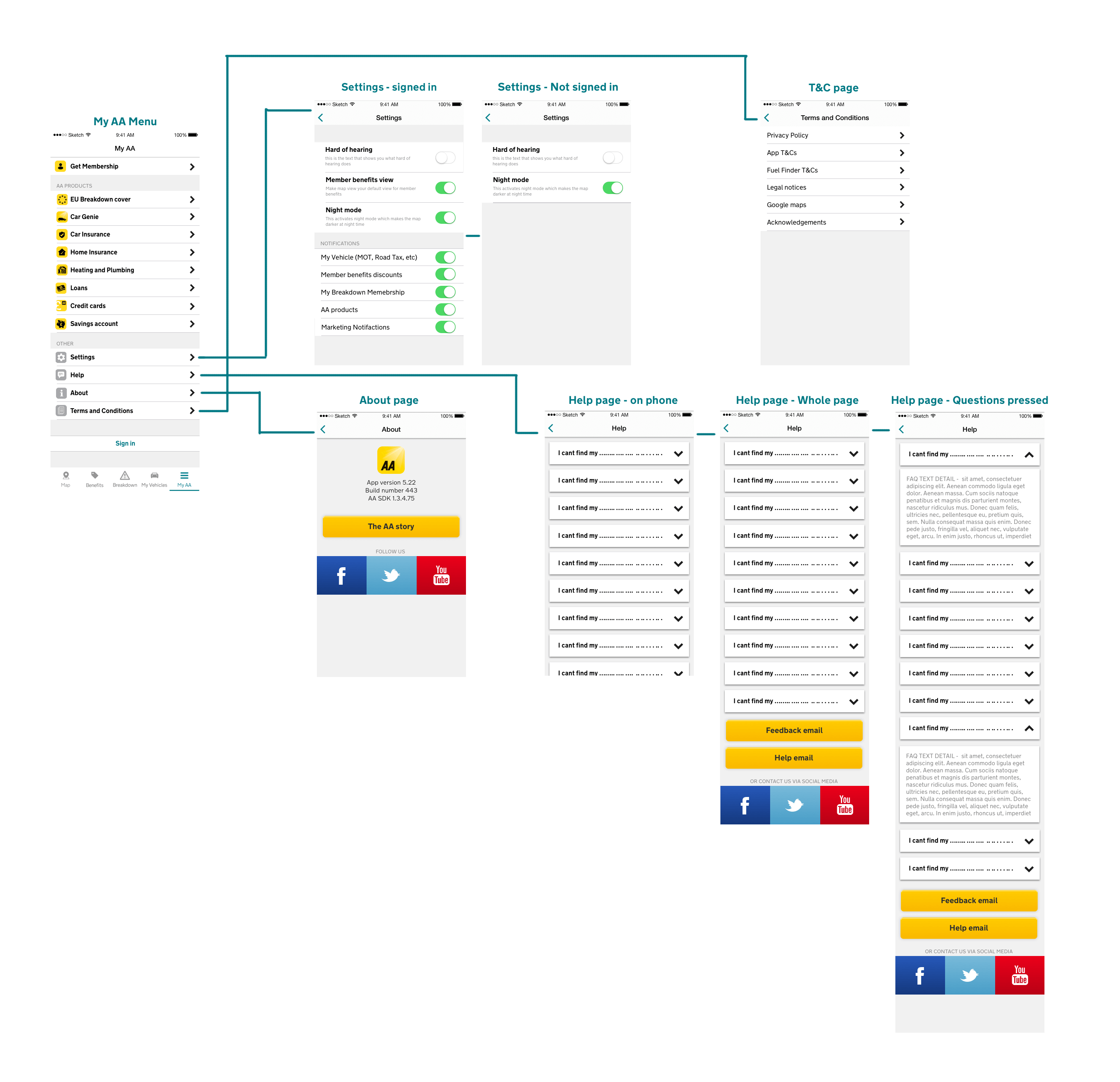
This is a wireframe for the My AA menu, this where the settings will be held along with FAQs, Terms and conditions amongst other things.
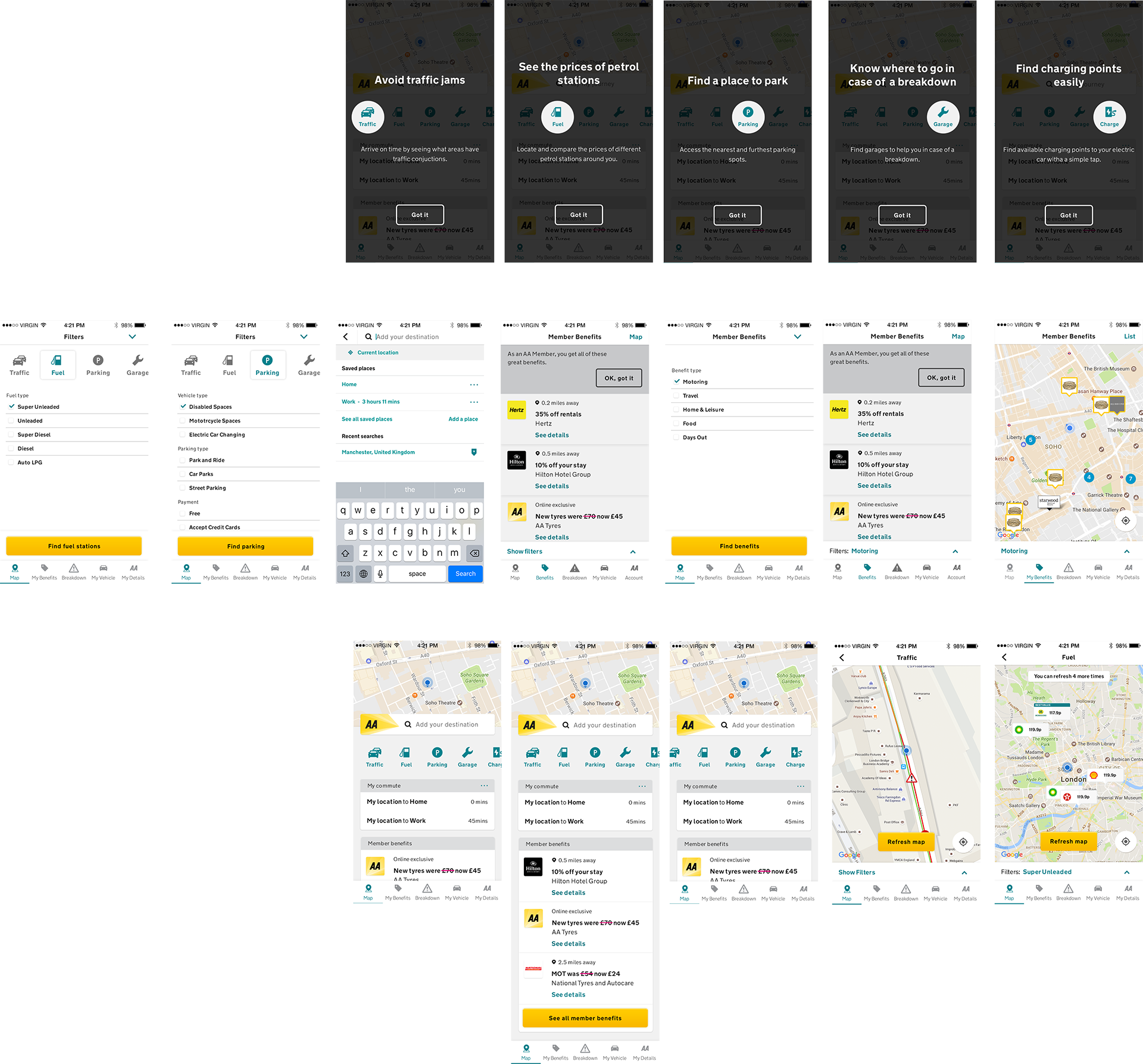
This is the overall user experience of the app that I modified many times, the main work I done to this app was, working on the on boarding process and adding to the current breakdown process, I had to keep in mind the AA brand guidelines when producing new pages.
I designed a new web link that would be sent to customers that have broken down that would help track them. This would be an addition to the app, as if the customers have not downloaded the app then this would be a method of identifying them. When designing this I had to keep in mind that the user is looking for feedback, that is where in the introduction to the time came in and why the first tile is more pronounced. Showing that this is the most current state.
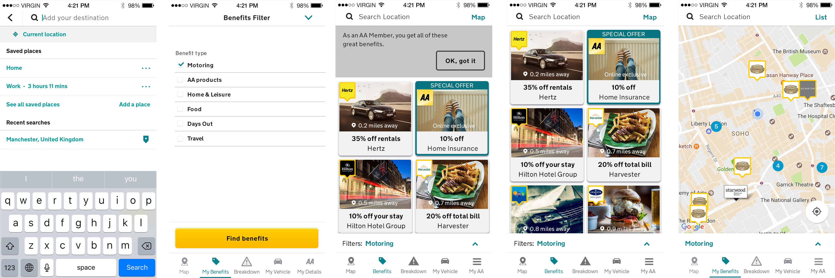
My mission was to massively improve the user experience of the member benefits. I done this by adding imagery to each benefit and totally changing the user experience of this section, I added a two column section which showcased different products and benefits. This could now give you the opportunity to cross sell other AA products. This would give better exposure to the benefits of the AA has to offer and get better customer retention.
I also created a new on boarding process screen just for the member benefits section. Please find prototype link below
This is the My AA menu that is now created in the app, you can see the process of this design from the wireframes above.
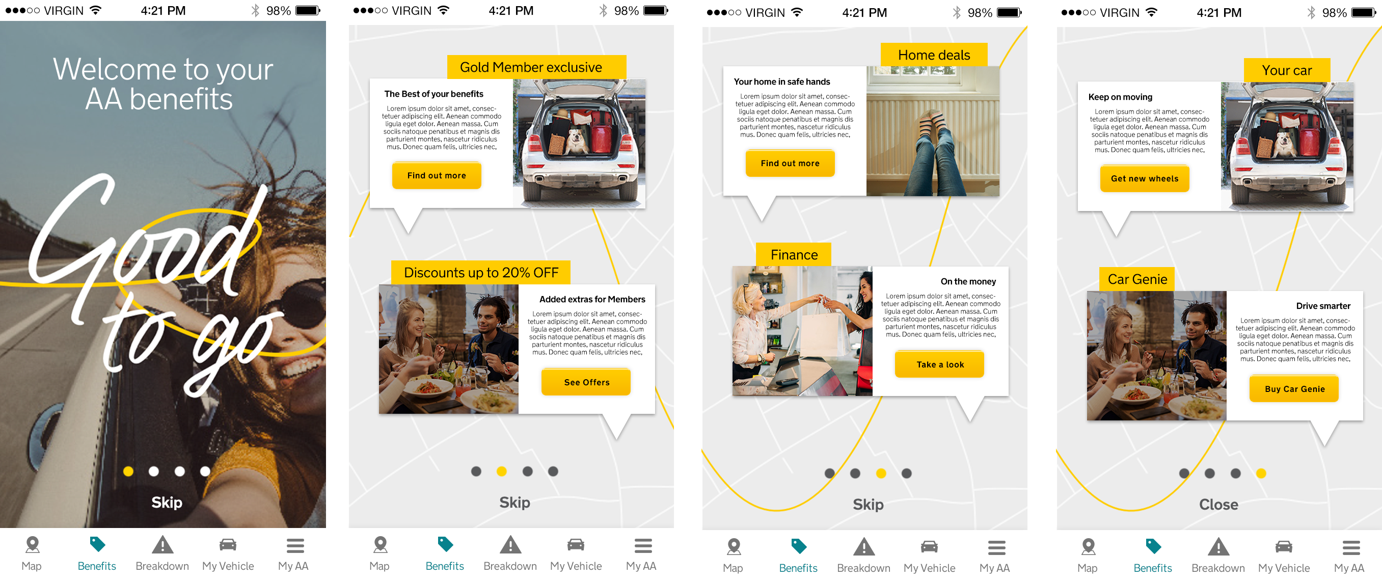
This is a on boarding journey that would start when you first get onto the AA app, the idea of this was to promote the AA benefits of having the app and not just the breakdown service. Adding to customer satisfaction and loyalty. Please see video for animation example
I added this feature to the AA app so that we could be in iphone customers wallets, We added this feature so membership cards can be added to your phone.

My work is now in development and you can see some of the features in the app now, the rest of my designs are in the product road map for the futures. It was a great pleasure working on the AA app and getting my work and designs to the millions. Because of my work and designs I have dramatically increase the usage and likability of the app please see this stat below of the AA compared to competitors.